| Photograph Information |
Photographer's Comments |
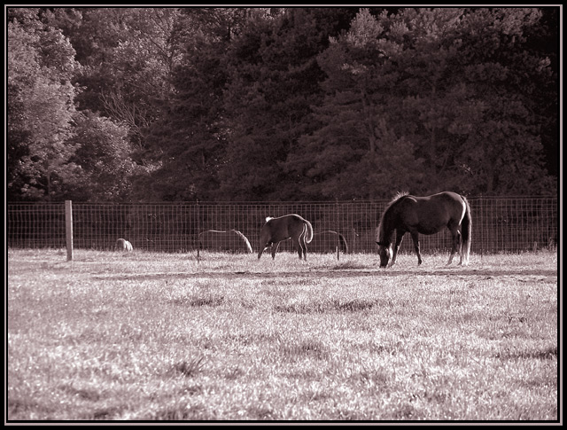
Camera: Kodak DX7590
Location: MSU Horse research facility, East Lansing, MI.
Date: Jul 30, 2005
Aperture: f3.7
ISO: 80
Shutter: 1/400
Galleries: Animals, Rural
Date Uploaded: Jul 31, 2005
Viewed: 439
Comments: 5
Favorites: 0
|
Liked the comp. with the horses in a line. Tried different crops, to get the fence line out of the center, but I just ended up thinking in this case, just looked better as is.
Tritone, did a color dodge layer and a hard light layer, both with opacity dropped to about 15%, curves with a very dramatic inverted S curve and a levels adj, both with opacity slightly dropped. Oh, and a little usm too. |
| Author | Thread |
|
|
09/09/2005 03:45:11 PM |
| Nice photo. Like the tones, the fence placement. What I would like better would be a little less brightness. It kind of feels too bright. |
|
 Photographer found comment helpful. Photographer found comment helpful. |
|
|
08/19/2005 10:55:17 AM |
| I think you did a great job editing this image. I will agree with the others that I would like to see a little of the grass cropped out. |
|
| Photographer found comment helpful. |
|
|
08/02/2005 08:07:52 PM |
| I agree with kearock - I'd crop some of the grass out, but my goodness, this is a terrific shot with the very "negative space" aspect of the horses being somewhat backlit, and parts of them blending into the background. Also love the color treatment - it suits the photo well. |
|
| Photographer found comment helpful. |
|
|
07/31/2005 08:50:45 PM |
| I might crop out a little of the lower grass so it doesn't dominate the horses, but I really like the color and the way the light catches the horses. |
|
| Photographer found comment helpful. |
|
|
07/31/2005 02:45:17 PM |
The grass just seems to be a little too bright for my taste. I keep looking at the grass instead of the horses. Perhaps if you could make the grass a little closer in darkness to the light tree on the left hand side of the picture? That fence post seems to be a little distracting as well. I don't know, just my thoughts after looking at the photo for a few minutes. I do indeed like the line of the horses and the saturation tone that you used.
Take care,
Dave |
|
| Photographer found comment helpful. |
Home -
Challenges -
Community -
League -
Photos -
Cameras -
Lenses -
Learn -
Help -
Terms of Use -
Privacy -
Top ^
DPChallenge, and website content and design, Copyright © 2001-2025 Challenging Technologies, LLC.
All digital photo copyrights belong to the photographers and may not be used without permission.
Current Server Time: 03/12/2025 04:24:09 PM EDT.