| Author | Thread |
Comments Made During the Challenge  |
|
|
05/18/2003 11:32:15 PM |
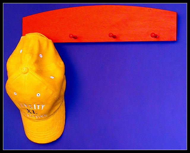
| Great colors I do like that its not center, but at the same time, I wish there was a little less open space. Its a nice photo though :) |
|
 Photographer found comment helpful. Photographer found comment helpful. |
|
|
05/18/2003 03:40:19 PM |
| Great solid colors... I would like to have seen the hat on the second peg to give a little more balance to the whole composition. |
|
| Photographer found comment helpful. |
|
|
05/18/2003 11:16:07 AM |
| Nice simple, well taken, colourful shot. Great work, well done. |
|
| Photographer found comment helpful. |
|
|
05/17/2003 01:20:01 PM |
| Cool idea, meets the challange perfectly, crispy clear colours and the negative space of the composition is cool too! 10 |
|
| Photographer found comment helpful. |
|
|
05/16/2003 11:43:36 PM |
| Good shot, I like the composition. |
|
| Photographer found comment helpful. |
|
|
05/16/2003 02:25:42 PM |
| Very nice, but the red is reading orange. |
|
| Photographer found comment helpful. |
|
|
05/15/2003 11:56:30 AM |
| Very effective photo -- excellent use of composition and color. |
|
| Photographer found comment helpful. |
|
|
05/14/2003 01:00:29 PM |
| Absolutely love this. The colours are vibrant and the composition is perfect with the cap off to one side of the rack. Noise is low and the focus is good. Well done! |
|
| Photographer found comment helpful. |
|
|
05/14/2003 10:46:06 AM |
|
| Photographer found comment helpful. |
|
|
05/13/2003 10:31:18 AM |
| Very vivid colours. Another simple but effective composition. |
|
| Photographer found comment helpful. |
|
|
05/13/2003 03:56:17 AM |
| Such a simple set up but with so much impact. You have a good imagination or a good eye. Or both :-) Well done. |
|
| Photographer found comment helpful. |
|
|
05/12/2003 11:18:14 PM |
| Great intensity in the colors. Great job! I might have cropped it so that it's Portrait (orientation), so that more of the hat, less of red peg hanger and blue is showing. Pretty cool. |
|
| Photographer found comment helpful. |
|
|
05/12/2003 10:39:28 PM |
| Vibrant colors and good clarity and clean appearance. I like the negative space, though there might be just a tad too much. Nice work! |
|
| Photographer found comment helpful. |
|
|
05/12/2003 05:40:28 PM |
| Very cute composition. The colors look a little harsh, but they stand out nicely. Good luck. Jacko. 9 |
|
| Photographer found comment helpful. |
|
|
05/12/2003 05:12:53 PM |
| I like this very much - good shot and such a simple idea, but like simple ideas it works very well. |
|
| Photographer found comment helpful. |
|
|
05/12/2003 02:55:20 PM |
| Simple, clean, good colors. |
|
| Photographer found comment helpful. |
|
|
05/12/2003 12:58:39 PM |
| This is an interesting shot, but the saturation of the colors seems a bit overpowering for my taste... |
|
| Photographer found comment helpful. |
|
|
05/12/2003 10:41:52 AM |
| I like this a lot. Very simple and well composed. Nice color and contrast! 9 |
|
| Photographer found comment helpful. |
|
|
05/12/2003 09:44:47 AM |
| Great use of colour.... really jumps off the page..... I think it would have worked better as a composition if you had moved the hat to either of the inner two pegs and maybe shoot it a little squarer to the hatrack.... I really like the colour saturation in this.... just a little let down by the composition... personally I would reshoot it.... I think it would be worth the effort..... good luck, Todd. |
|
| Photographer found comment helpful. |
|
|
05/12/2003 06:02:42 AM |
| You have cropped it a bit close at the top and the left. I would have given it a bit more space. I like it though. |
|
| Photographer found comment helpful. |
|
|
05/12/2003 12:20:17 AM |
| This is very well lit and saturated. A little more blue to the left of the hat and above the pegs would really make this a 10+ shot! -danny |
|
| Photographer found comment helpful. |
Home -
Challenges -
Community -
League -
Photos -
Cameras -
Lenses -
Learn -
Help -
Terms of Use -
Privacy -
Top ^
DPChallenge, and website content and design, Copyright © 2001-2025 Challenging Technologies, LLC.
All digital photo copyrights belong to the photographers and may not be used without permission.
Current Server Time: 03/11/2025 02:27:21 PM EDT.