| Author | Thread |
|
|
07/08/2002 02:58:00 PM |
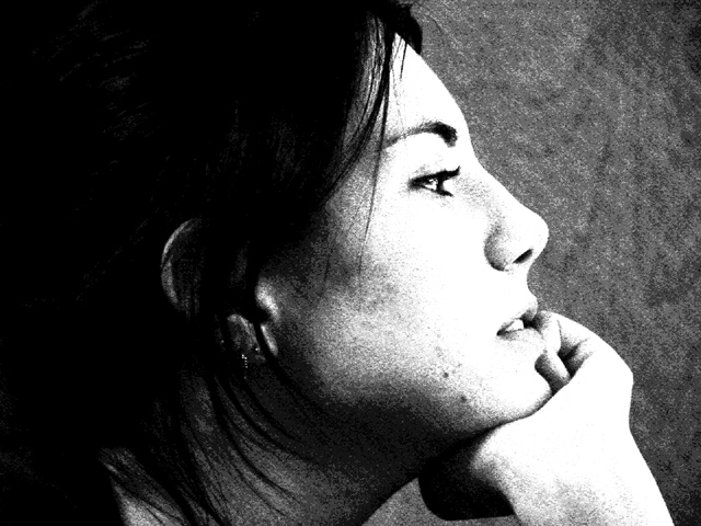
| "Or like some people say, just gives me crappy results. :-)" ... hehehehe.. I personally like the photo very much. |
|
Comments Made During the Challenge  |
|
|
06/09/2002 09:33:00 PM |
| I'm wondering if you got hammered for what I'm guessing is taking your levels to some extremes. I like the look and think it works really well. (When the image was only half loaded, it made me think of a Geisha girl -- or maybe a publicity shot from something like The Mikado.) It might defeat the ideas you were going for when you shot, but I wonder what kind of mood this would have if she were further to the left. Right now, she feels too close to the right edge -- totally a personal taste thing. |
|
|
|
06/09/2002 08:50:00 PM |
| like the over exposed look - works well for this. Too much black on the left ? but balances well with the white and grey regions. Good shot. Maybe a bit too grainy ? |
|
|
|
06/09/2002 04:44:00 PM |
| I like the contrast and compostion of this picture. But because the model is looking at something at the right side I think she should have been positioned more to the left. This would have minimized the dominating black hair as well. Just because of that I give it a 9 instead of a 10 |
|
|
|
06/09/2002 12:07:00 PM |
| The grain works very well is this shot. Her hair coming around her neck adds a nice touch, as does the expression on her face. |
|
|
|
06/09/2002 12:18:00 AM |
| I like the gritty feel to this portrait as well as the composition. The divisions of dark hair, light face, and midtone background works well. |
|
|
|
06/08/2002 01:58:00 PM |
| An interesting technique, but used on the wrong subject. |
|
|
|
06/07/2002 08:50:00 PM |
|
|
|
06/06/2002 08:39:00 PM |
|
|
|
06/06/2002 08:44:00 AM |
| looks kind of like bjork. the grain adds a filmic quality that i appreciate. |
|
|
|
06/06/2002 12:06:00 AM |
| I like your idea of doing a kind of "reverse silhouette." Conveys a lot of "information without much "data." |
|
|
|
06/05/2002 10:55:00 PM |
| The lighting is too harsh on the face. Also the picture is way too grainy. |
|
|
|
06/05/2002 02:41:00 PM |
| Dark and grainy, but I think you planned it this way. One of the better people shots in this weeks challenge. The contrast is very good. I like the focus. Lots of texture and the background is interesting. Very artsey IMO. I like it. A 7. |
|
|
|
06/05/2002 01:41:00 PM |
| I like the grainyness, and the hair across her neck. Actualy, I think I'd have liked to see a bit more detail in the hair, though the lost detail in the face doesn't bother me so much. |
|
|
|
06/05/2002 11:49:00 AM |
| Nice shot - I like the effect. |
|
|
|
06/05/2002 11:30:00 AM |
| I love the grain in the L bg. Not as wild about it on her face. The high contrast is good for defining the line of her profile (possibly better w/o the hand), but I'd prefer it smoothed out just a bit. Very worth looking at. Thanks! |
|
|
|
06/05/2002 04:35:00 AM |
| Almost lith film like quality. Nice work. |
|
|
|
06/05/2002 04:22:00 AM |
| Obviously the contrast and grain are intended, but I just don't find this appealing, like around her neck, the black hair blends in with folds - or is it just hair? (sorry) |
|
|
|
06/04/2002 11:07:00 PM |
| interesting... this is an excellent composition... The lighting is great and the grain is very nice too... good job! |
|
|
|
06/04/2002 11:06:00 PM |
| Great contrast and grain---exellent. |
|
|
|
06/04/2002 10:32:00 PM |
|
|
|
06/04/2002 07:02:00 PM |
| Beautiful grainy almost infrared appearance. Solid division between dark (back of head) and light (face) areas of the subject. |
|
|
|
06/04/2002 04:58:00 PM |
| I can already hear the tons of comments about the grain. But I'm gonna just say I like this. Don't listen to them. |
|
|
|
06/04/2002 02:54:00 PM |
| Good pose, but too high contrast and grainy for my taste in portraits. |
|
|
|
06/04/2002 05:30:00 AM |
| I LOVE this high contrast, grainy black and white. It's a relief from all the other photos I've rated so far. The way it brings out her eyelashes, lips, etc. is really nice. Well done. |
|
|
|
06/03/2002 09:10:00 PM |
| Nice profile. The graininess (at least on my computer) seems to detract from the overall appeal, though. |
|
|
|
06/03/2002 06:35:00 PM |
|
|
|
06/03/2002 03:35:00 PM |
| Nice portait, good tone. Yes, I like this very much. |
|
|
|
06/03/2002 03:25:00 PM |
| Contrast is too high, whites out the face. |
|
|
|
06/03/2002 11:07:00 AM |
| Just a little sharper and this would get a 10 from me. I like the grainy look. (I'm assuming you accomplished that without violating the rules) This is one instance where washed out highlights and featureless shadow work. Nice cropping as well. It works well. Good job. |
|
|
|
06/03/2002 10:29:00 AM |
|
|
|
06/03/2002 07:44:00 AM |
|
|
|
06/03/2002 07:42:00 AM |
| GREAT GREAT composition.. EXCELLENT use of B&W for contrast. This picture is laid out very well and the the balance of light and dark is pure ART! From darkest black to lightest white. You truly did a great job. |
|
Home -
Challenges -
Community -
League -
Photos -
Cameras -
Lenses -
Learn -
Help -
Terms of Use -
Privacy -
Top ^
DPChallenge, and website content and design, Copyright © 2001-2025 Challenging Technologies, LLC.
All digital photo copyrights belong to the photographers and may not be used without permission.
Current Server Time: 03/13/2025 03:45:00 PM EDT.