| Author | Thread |
|
|
05/21/2003 12:13:25 AM |
| It's fun to see you do new things! THis was a cool shot. |
|
Comments Made During the Challenge  |
|
|
05/20/2003 02:20:34 PM |
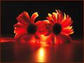
| nice job i really like the colors, but what is in the cups-----juice or alcohol? |
|
|
|
05/20/2003 04:02:11 AM |
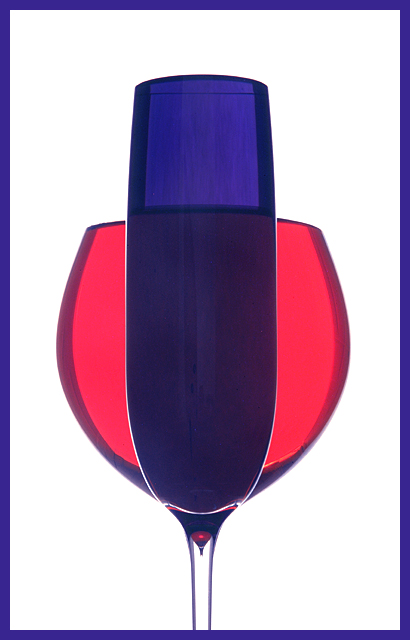
| Very good idea but pity this 1st glass isn't more see thru. |
|
 Photographer found comment helpful. Photographer found comment helpful. |
|
|
05/19/2003 10:40:00 PM |
| Not your typical glass shot. I like it, esp. the shadow on the sides of the glasses. |
|
| Photographer found comment helpful. |
|
|
05/18/2003 11:35:25 PM |
| Simple and clean. Great work. I wish I could get glass to look that good lol |
|
|
|
05/18/2003 08:09:58 PM |
| the background color looks pink |
|
|
|
05/18/2003 04:24:04 PM |
| Very good image. Works well with the theme of this challenge. Very good technically. Good luck. 8 Morgan |
|
|
|
05/17/2003 09:03:49 PM |
| I like the picture, but the colours don't look blue and red, which are primary colours, not secondary. |
|
| Photographer found comment helpful. |
|
|
05/17/2003 05:11:01 PM |
|
|
|
05/17/2003 10:55:46 AM |
| Fun, unique perspective. LIghting is wonderful. |
|
| Photographer found comment helpful. |
|
|
05/16/2003 03:37:10 PM |
| Very cool. But aren't these colors red and blue? Nothing secondary about that! :) |
|
|
|
05/16/2003 01:00:26 AM |
| Very nice composition and execution. But... the purple from the red and blue does not come out. |
|
| Photographer found comment helpful. |
|
|
05/15/2003 10:22:41 PM |
| Nice idea to mix two primary colours. Unfortunately, since red is a very prominent colour the red glass has hijacked your image. |
|
| Photographer found comment helpful. |
|
|
05/15/2003 10:20:46 PM |
| bravo......well done. good light control, good color. |
|
| Photographer found comment helpful. |
|
|
05/15/2003 06:25:51 PM |
| Makes me think you are a commercial artist who frequently works on beverage shots. Ha ! |
|
|
|
05/15/2003 12:11:41 PM |
| Interesting idea. Looks like red and blue to me, but then I'm partially colour blind, so whatever. Nice composition. |
|
|
|
05/14/2003 09:47:04 PM |
|
|
|
05/14/2003 02:25:51 PM |
| Nice idea. I dont think that these display secondary colors very well. Good choice of background color though. |
|
| Photographer found comment helpful. |
|
|
05/14/2003 12:48:52 PM |
| Simple, effective, attarctive. I like the muted colours. Well done. |
|
| Photographer found comment helpful. |
|
|
05/14/2003 11:59:27 AM |
| cunnning....... lookd really cool.... perhaps using lighter colours would have improved the result... |
|
| Photographer found comment helpful. |
|
|
05/14/2003 08:10:51 AM |
| Nice and simple but very powerful and effective, well done, 10 - Gary. |
|
| Photographer found comment helpful. |
|
|
05/14/2003 07:22:54 AM |
| Red + Blue = Purple? Great Shot! |
|
| Photographer found comment helpful. |
Home -
Challenges -
Community -
League -
Photos -
Cameras -
Lenses -
Learn -
Help -
Terms of Use -
Privacy -
Top ^
DPChallenge, and website content and design, Copyright © 2001-2025 Challenging Technologies, LLC.
All digital photo copyrights belong to the photographers and may not be used without permission.
Current Server Time: 03/12/2025 08:01:50 AM EDT.