| Author | Thread |
|
|
05/22/2003 07:34:39 PM |
*Critique Club*
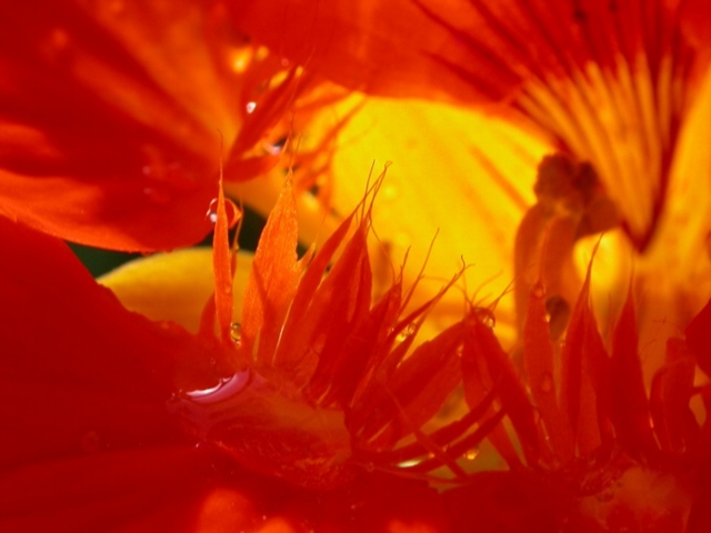
I like this, and I can see what you were trying to do here, and it's a great idea.
I do have to agree with some of the other commets though that the important part (in my opinion) seems to blend in a lot with the surroundings, making it seem a but mushed.
The color is beautiful. I like how it take up the whole shot, but unfortunately it also absorbs some of the detail as well.
I almost missed the water droplet, it's hidden down there in all the color.
I am glad for the small patch of yellow in the background, it does help the little wiskers in the middle to stand out a bit better than the rest of the shot.
A really pretty macro. Just maybe TOO much color. lol
~Heather~ |
|
Comments Made During the Challenge  |
|
|
05/20/2003 03:23:57 PM |
| looks like underwater, i like this one ! |
|
|
|
05/20/2003 02:28:08 PM |
| nice job i really like the colors |
|
|
|
05/20/2003 01:35:58 PM |
| The angle of this photo makes the subject interesting. |
|
|
|
05/19/2003 10:16:28 AM |
| i think you may have gotton to close to the flower, you can't really tell what it is but the color is very bright and i like the focus so i give you a 8 |
|
|
|
05/18/2003 07:05:05 PM |
| not enough contrast.. the middle just all sorts of blends in together. maybe more sharpness too |
|
|
|
05/16/2003 02:26:03 PM |
| all a little to close up for my liking... looks a little like some sort of seafood... haaahaaa... anyway... perhaps somthing that gives a little more contrast in the background would have helped.. 6 |
|
|
|
05/16/2003 01:02:19 PM |
| nice image, i may have tried to adjust the contrast or the lighting to make the water drop more visible, other than that this is a good image |
|
|
|
05/15/2003 02:42:00 PM |
| neat. almost too cropped in however, and the backlight doesn't allow you to fully see and appreciate the in focus parts in the forefront. the color looks great. |
|
|
|
05/15/2003 01:33:11 PM |
| Nice image. Good color and good display of texture as well. Good job. |
|
|
|
05/15/2003 11:47:10 AM |
| Not much definition here. It is hard to see what I am looking at. Maybe a cahnge in lighting would have given more contrast (more shadows). I would have added a simple white boarder... |
|
Home -
Challenges -
Community -
League -
Photos -
Cameras -
Lenses -
Learn -
Help -
Terms of Use -
Privacy -
Top ^
DPChallenge, and website content and design, Copyright © 2001-2025 Challenging Technologies, LLC.
All digital photo copyrights belong to the photographers and may not be used without permission.
Current Server Time: 03/13/2025 02:05:14 AM EDT.