*Critique Club*
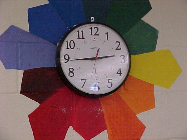
The challenge was for secondary colors. While there are secondary colors in the photo, I don't think that they are the main subject. There are also many OTHER colors in the photo, and I think that they drowned out the purpose of the challenge.
Setting that aside, about the image itself...
It does seem that the lighting wasn't the best for the shot. There is glare on the clock, and not enough light on the colors. They seem dark. I bet that some brightness and saturation adjustments could help bring out the colors a bit more, just be careful not to brighten the glare on the clock as well.
Focus is ok, but maybe a touch soft. The little 'minute' lines dissapear in places. I'd like to see that a bit more uniform.
I think that the subject might be a little too centered. There is a slight tilt to the clock, however, not enough to make a dramatic visual effect. As is, it looks like an accident. I also wonder if you cropped the top and bottom the same, if that might help to balance this out some.
I think it's an interesting subject, with the colors around it like that, just maybe not specific enough to be effective in the secondary colors challenge.
~Heather~
You guys still going to be able to submit during the summer? |