| Author | Thread |
Comments Made During the Challenge  |
|
|
08/16/2005 04:48:37 PM |
| Like this one. Reflections are great - pity about the poster - you will get marked down for the small size, PM me if you want help. |
|
|
|
08/15/2005 09:10:06 PM |
| Too bad this image is so small. Would have been nice to look at a little larger. Check the "Learn" section on th website to see how to produce 150kb images that approach the 640 pixels max size. |
|
|
|
08/15/2005 07:34:16 PM |
|
|
|
08/15/2005 02:15:37 PM |
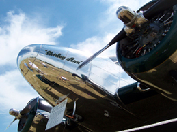
| Now there's a beauty! Douglas DC-3...my father flew one years ago. Just a gorgeous aircraft, and very capable. I wish this shot was a bit bigger (ie - full 640 x whatever), but otherwise, I have no complaints. To anyone that knows aviation, this screams it's year. Best of luck to you! 10 |
|
|
|
08/13/2005 11:31:42 PM |
| Just looks cool. Obviously would be better without the plaque. |
|
|
|
08/13/2005 09:19:30 PM |
| lovely.... would love to see it bigger though... well done.. 9 |
|
|
|
08/13/2005 01:07:39 PM |
| I like the content..I think. The picture is too small to really judge. Sorry. |
|
|
|
08/13/2005 10:01:21 AM |
| too small. should be 640 pixels wide! otherwise, not a bad shot, although I think i would have tried to get a shot without the big plaque thingy in it. |
|
|
|
08/13/2005 01:10:02 AM |
| 6 - Good idea for capturing an essence of this era for the Challenge (in my opinion a shot of this into a time capsule for this year depicts the era well). Criticism; as I am sure you both know and are being 'told', a bigger shot. Whilst a sepia style for this era would work well I think the colors here are great. I really like the ultra polish on the metal, especially set against the sky. A different angle (especially to try to exclude/hide that 'sign' would make this a better photograph in my opinion. Also, to be able to include both 'engines'/blades. |
|
|
|
08/13/2005 12:16:55 AM |
| FInally! Someone who followed directions, used the year for the title and submitted a GOOD photo. You deserve a 10! |
|
|
|
08/11/2005 03:19:17 PM |
| This looks like it would have been a nice picture. Beautiful sky and nice perspective. Needs to be bigger though. |
|
|
|
08/11/2005 11:34:33 AM |
| A larger image would give more impact. |
|
|
|
08/11/2005 12:08:11 AM |
| Too bad this is too small. If it was larger, this would have been in the top 20 for sure |
|
|
|
08/10/2005 11:41:21 PM |
| Too bad the tattle tell museum sign is in the way. |
|
|
|
08/10/2005 10:44:47 PM |
| great how you've got the sky above |
|
|
|
08/10/2005 09:38:53 PM |
| It's a good photo to put it in this size, maybe a little bit bigger to appreciate the details. |
|
|
|
08/10/2005 05:04:46 PM |
| Beautiful shot. I want it to be bigger to get my attention. |
|
|
|
08/10/2005 04:48:12 PM |
| Oh how I wished this was a larger image canvas. *7* because of the lack of details observable at this size. |
|
|
|
08/10/2005 03:52:42 PM |
| I would have loved to see a larger version of this photo. |
|
|
|
08/10/2005 12:49:18 PM |
|
|
|
08/10/2005 10:26:34 AM |
| a very cool subject for this challenge! a shame this is too small to do well here, please check the tutorial regarding re-sizing for the next challenge to get the most out of your effort this looks like a great shot from what i can see |
|
|
|
08/10/2005 04:12:11 AM |
| too small - use the full 640 pixels |
|
|
|
08/10/2005 01:57:43 AM |
| I would have liked to see this photo bigger but from what I can see, it's very nice. |
|
|
|
08/10/2005 12:48:09 AM |
| The small photo size makes this hard to rate. |
|
|
|
08/10/2005 12:29:41 AM |
| This is a grat photo (I think.) I would have given this a couple of extra points if it had been bigger and I could have seen the details. |
|
Home -
Challenges -
Community -
League -
Photos -
Cameras -
Lenses -
Learn -
Help -
Terms of Use -
Privacy -
Top ^
DPChallenge, and website content and design, Copyright © 2001-2025 Challenging Technologies, LLC.
All digital photo copyrights belong to the photographers and may not be used without permission.
Current Server Time: 03/12/2025 09:50:21 PM EDT.