| Author | Thread |
Comments Made During the Challenge  |
|
|
08/14/2005 08:53:42 PM |
I guess I don't get what the illusion is supposed to be. This shot looks like it is supposed to be centered, but isn't. It's also very flat. Some side lighting would at least have brought some depth to the frame. I'm afraid it just ain't very interesting...
TC |
|
|
|
08/14/2005 06:14:50 PM |
| Where/what is the illusion? Certainly not your post processing?? Am I missing something? |
|
|
|
08/13/2005 08:03:24 PM |
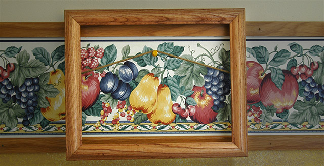
| The frame appears to be a bit crooked. I'm not sure what the illusion is since we can see it's a picture frame hanging on a wall over top of some wall paper stuff. Unless that's not what it is, I supose. Focus is a bit soft. lighting appears ok to me. wish that maybe the frame weren't directly in the center of the image. seems to be lacking something to make it more visually appealing. Technically ok though. ~Heather~ |
|
|
|
08/12/2005 07:51:11 PM |
| I think this idea needed a bit more development... and the slant of the crop is slightly bothersome to me |
|
|
|
08/12/2005 12:21:52 AM |
| I can see your idea for the illusion but I don't think you have pulled off to well. The frame is also tilted which distracts. |
|
|
|
08/12/2005 12:20:40 AM |
| I am missing the illusion. It looks like an empty frame hung over a wallpaper border. Technically the image has some nice color, especially the center wood, although the color fades on the right. The lighting does not really enhance the shot, not does the compostion. There is plenty of detail in the image. 3 |
|
|
|
08/11/2005 01:10:59 PM |
| I particularly like the way that the area inside the frame is brighter than the rest. |
|
|
|
08/11/2005 12:40:49 PM |
| simple and effective. I like the idea, I am one that likes their horizontals and verticles and fing the slightly off skew frame a little distracting. |
|
|
|
08/10/2005 12:08:30 PM |
| interesting how the framed section has a brighter look |
|
|
|
08/09/2005 02:35:53 PM |
| i like that the lighting inside the frame is brighter than outside the frame - nice addition |
|
|
|
08/09/2005 12:14:39 PM |
| this is a constructive shot, the frame is crooked, i like how you lighend the color in the frame, makes it stant out beter, over all a good shot, with color, |
|
|
|
08/09/2005 03:46:24 AM |
I see what you were after, but to me at least, it is not very effective. More contrast might have helped between what's in and what's out of the painting. Right angles too.
Good Luck! |
|
|
|
08/09/2005 01:42:23 AM |
| No illusion here... I'm sorry. It's just a frame in front of wallpaper. What gives? |
|
|
|
08/08/2005 09:33:54 PM |
| Cute idea. I think it might have worked a little better with something to cover the border on the sides of the frame though. |
|
|
|
08/08/2005 09:06:31 PM |
| reall went all out on this one eh? |
|
|
|
08/08/2005 12:00:26 PM |
| Very clever. The centre frame is not quite true though so it just throws the effect out a little bit. |
|
|
|
08/08/2005 11:33:54 AM |
| Great color, I like the texture, good lighting. |
|
|
|
08/08/2005 11:21:14 AM |
| the idea is good but the photo just seems dull |
|
|
|
08/08/2005 09:14:04 AM |
| Just a tad weak in the illusion department, IMO. Technically, not a bad picture. I like the lighting. The crop looks a tad crooked...could be rotated to the right just a couple of degrees. Also, with this being advanced editing, the nail holes at the right could have been cloned out. |
|
|
|
08/08/2005 02:07:43 AM |
| I may be slow. This appears to be an empty frame hanging on the wall with a thumbtack. Am I missing the illusion? |
|
Home -
Challenges -
Community -
League -
Photos -
Cameras -
Lenses -
Learn -
Help -
Terms of Use -
Privacy -
Top ^
DPChallenge, and website content and design, Copyright © 2001-2025 Challenging Technologies, LLC.
All digital photo copyrights belong to the photographers and may not be used without permission.
Current Server Time: 03/17/2025 03:29:32 PM EDT.