| Author | Thread |
Comments Made During the Challenge  |
|
|
06/09/2002 10:39:00 PM |
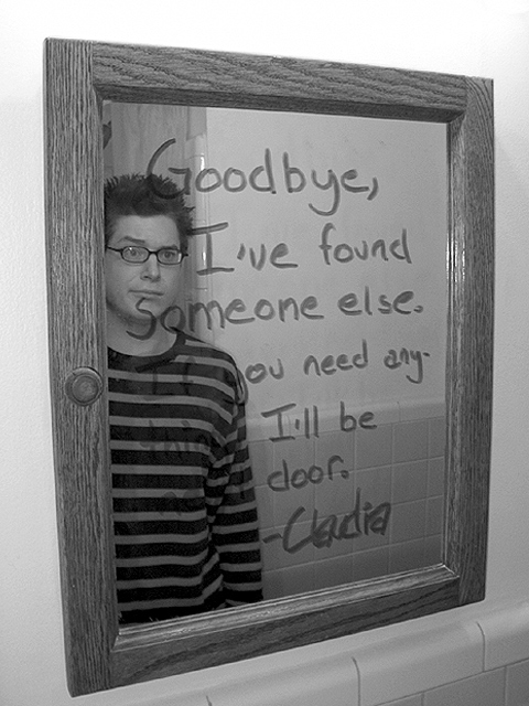
| this has to be the best and most origional idea. If you need any what?> I can't make it out. still, a 10 |
|
|
|
06/09/2002 07:56:00 PM |
| You didn;t need her anyways.....I guess |
|
|
|
06/08/2002 11:08:00 PM |
| Very funny idea - great facial expression. The stripes on the shirt make it a little hard to read the whole message. |
|
|
|
06/07/2002 03:28:00 PM |
| Needed a white shirt, nice concept for the shot |
|
|
|
06/07/2002 02:22:00 PM |
| Great picture, lot of emotion into it. |
|
|
|
06/07/2002 11:35:00 AM |
| Fun idea. Well framed. I think a white shirt on the guy (love the expression, glasses, and hairstyle btw) would've allowed the viewer to read the whole message better. Also, just a tad more contrast would be nice. |
|
|
|
06/07/2002 02:12:00 AM |
|
|
|
06/06/2002 09:32:00 PM |
| If you wanted the main focus to be on the writing, John should have been wearing a light colored shirt. If you wanted the focus of the picture to be on John's excellent facial expression, I think the line "someone else." should have been moved downward so john's face is unobstructed. |
|
|
|
06/06/2002 12:48:00 PM |
| Looks like he's thinking, 'My *mirror*! Damn you , Claudia...' A little tough to read against the shirt. |
|
|
|
06/06/2002 12:42:00 PM |
| he doesn't look too upset or surprised...and the lettering blends in with his shirt |
|
|
|
06/05/2002 10:11:00 PM |
|
|
|
06/05/2002 05:15:00 PM |
| This is my favorite 'subjective' photo this week... I'm scoring this photo high purely on the subjective value of it... This is very creative! Good job! - 9 |
|
|
|
06/05/2002 10:48:00 AM |
| Funny :). The expression on his face is great. The black and white just makes the situation more dramatised, and accentuates the humour. |
|
|
|
06/05/2002 09:29:00 AM |
| Very innovative. John needs a lighter shirt though. |
|
|
|
06/04/2002 11:04:00 PM |
| the shirt blocks out the wording, perhaps a light solid color shirt would have been a better choice. great imagination. |
|
|
|
06/04/2002 07:37:00 PM |
| The composition tells the story alright. I'd prefer less middle gray in the photo. |
|
|
|
06/04/2002 10:29:00 AM |
| Good for you, Claudia. He looks like a real dork. |
|
|
|
06/04/2002 05:24:00 AM |
A lighter t-shirt would of allowed the writing to be more visible. very funny tho.
Been there, done that ;-) |
|
|
|
06/04/2002 12:06:00 AM |
| I hope this is not real!! If it is, I may change the title to POOR JOHN!! |
|
|
|
06/03/2002 11:52:00 PM |
|
|
|
06/03/2002 08:24:00 PM |
|
|
|
06/03/2002 06:53:00 PM |
| I like the dear john needed a different shirt to see the writing |
|
|
|
06/03/2002 05:28:00 PM |
| Neat shot--super creative work, sadly I can't read all of the message. Fun shot. Good job. |
|
|
|
06/03/2002 04:47:00 PM |
| Hehe... original and funny. |
|
|
|
06/03/2002 03:03:00 PM |
| Funny in a grey sort of way. |
|
|
|
06/03/2002 02:06:00 PM |
| can't read it all, but it's good. |
|
|
|
06/03/2002 01:54:00 PM |
| A little goofy, but good. It's too bad that the writing is somewhat washed out by the shirt. |
|
|
|
06/03/2002 11:16:00 AM |
| Nice idea, but the dark shirt really hides the words on the bottom left. |
|
|
|
06/03/2002 09:15:00 AM |
| One of 2 10's for me this week. |
|
|
|
06/03/2002 09:13:00 AM |
|
|
|
06/03/2002 07:24:00 AM |
i like!!
interesting idea.. |
|
|
|
06/03/2002 05:40:00 AM |
| Very creative. A little hard to read some of the text, perhaps the model could have worn a white shirt to bring out the writing. Great shot though. |
|
|
|
06/03/2002 03:54:00 AM |
|
|
|
06/03/2002 12:59:00 AM |
| I can't read all of the message. This probably would have been better in color as well. |
|
|
|
06/03/2002 12:46:00 AM |
|
|
|
06/03/2002 12:45:00 AM |
|
Home -
Challenges -
Community -
League -
Photos -
Cameras -
Lenses -
Learn -
Help -
Terms of Use -
Privacy -
Top ^
DPChallenge, and website content and design, Copyright © 2001-2025 Challenging Technologies, LLC.
All digital photo copyrights belong to the photographers and may not be used without permission.
Current Server Time: 03/12/2025 02:02:16 AM EDT.