| Author | Thread |
Comments Made During the Challenge  |
|
|
08/16/2005 09:50:36 AM |
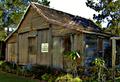
| Nice shot, gives a real sense of the passage of time. |
|
|
|
08/14/2005 06:55:21 PM |
| I like the concept. I wonder how this would be with a bit more contrast? Well done. |
|
|
|
08/13/2005 11:13:25 AM |
| this is a nice composition that i think would look better if it was higher contrast. i don't see any true blacks or whites. it's all just midtones (shades of grey). i wonder what the color version looked like... 6. |
|
|
|
08/12/2005 02:06:35 AM |
| Not very attractive per se but surely a sign of that time, could have been more contrasted though.. |
|
|
|
08/10/2005 11:18:43 PM |
| You have done a great job capturing time. |
|
|
|
08/10/2005 01:34:04 PM |
| I think for a black and white there is not enough contrast here. |
|
|
|
08/10/2005 01:12:18 AM |
| to me this shot is dull... it could have used more post editing |
|
Home -
Challenges -
Community -
League -
Photos -
Cameras -
Lenses -
Learn -
Help -
Terms of Use -
Privacy -
Top ^
DPChallenge, and website content and design, Copyright © 2001-2025 Challenging Technologies, LLC.
All digital photo copyrights belong to the photographers and may not be used without permission.
Current Server Time: 03/12/2025 06:26:29 PM EDT.