| Author | Thread |
|
|
05/30/2003 02:53:50 AM |
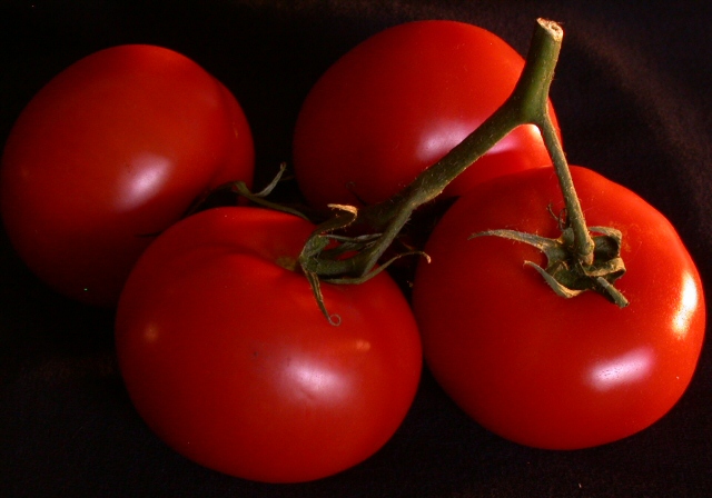
I suspect that on the photographer's monitor (as on mine) those tomatoes look predominantly red, not orange, nicely complementing the green stems, a true compliment to their ability to control the lighting and exposure.
I guess we must start a forum thread about the exact wavelength/RGB values demarcating the boundary between red and orange. However, since I myself am red/green color-blind (see my entry) I will recuse myself from that discussion... |
|
 Photographer found comment helpful. Photographer found comment helpful. |
|
|
05/29/2003 10:52:55 PM |
*Critique Club*
Am I missing something here? I thought that the compliment to orange is blue? I think this would have worked well in the secondary colors challenge. Where secondary colors are Orange and Green (and purple, which doesn't apply here).
Anyway, Setting that aside to talk about the photo itself...
It's a very good image. I think it may need a bit more lighting. I think that the lighting on the stems is a bit dark, and even if they had been an important color in this shot, they would be a bit dark to really bring the color out to the full potential anyway.
The color of the tomato is really good. I think that the orange stands out very nicely here. It is strong, and vivid, and very effective on the topic of color. However, when talking about complimentary, I feel that there needs to be 2 strong colors, and the green (even if it WAS the compliment of orange) is not strong enough to qualify for this.
Focus and clarity are really good. I think that you show us good detail in the stem and the smoothe texture of the tomato really stands out nicely.
I like the set up. The angle and framing/cropping you have chosen for these garden goodies is really good. I think that the way the area setting is good. I only wonder though if you could have not cropped the left tomato, or have cropped it more. Right now, you just barely shave off a bit of the tomato, and have not cropped any of the other ones, so it almost looks like a bit of an accident. Not really anything that was done for a reason.
Maybe a side light shining right on the stems (so it misses the tomato) would help the stems to shine more, and not put too much lighting on the shiny tomato.
Yummy looking for sure.
~Heather~ |
|
| Photographer found comment helpful. |
Comments Made During the Challenge  |
|
|
05/24/2003 11:45:11 PM |
| Yummy! Your lighting makes these look good! |
|
| Photographer found comment helpful. |
|
|
05/23/2003 09:40:26 PM |
| Really like this - I think the lighting is excellent! Nice job:) |
|
| Photographer found comment helpful. |
|
|
05/22/2003 07:56:37 PM |
| Yummy tomatoes, but I think the contrast between the colour complements would have been highlighted better by tomatoes actually on a vine. The green seems a bit washed out and not as obvious as one might want for this topic. |
|
| Photographer found comment helpful. |
|
|
05/22/2003 04:36:39 PM |
| Very nice warm colors. I also like the soft, subtle lighting. |
|
| Photographer found comment helpful. |
|
|
05/21/2003 03:57:45 PM |
| More light on the stocks to accentuate greem? |
|
| Photographer found comment helpful. |
|
|
05/20/2003 11:53:52 PM |
| I really like this composition and you've captured that waxy look of the fruit.=7 |
|
| Photographer found comment helpful. |
|
|
05/19/2003 07:09:40 PM |
| meets the challenge but really needs better lighting or background to have a lot of interest. Perhaps not using a black background could have made a more interesting final result ? |
|
| Photographer found comment helpful. |
|
|
05/19/2003 06:13:55 PM |
| i think this tight composition works fairly well in this particular shot... the only real weak point in this shot for me is the green stem... I don't guess there was a good way to brighten that up some... that would enhance the complementary color element of the photo quite a bit... = 6 |
|
| Photographer found comment helpful. |
|
|
05/19/2003 04:46:51 PM |
| a little dark. i'm not sure if you muted the light source to reduce the reflection. with the vine being green, i think it would have benefited if you had been able to pull some more of that out of the photo. |
|
| Photographer found comment helpful. |
|
|
05/19/2003 03:46:00 PM |
|
| Photographer found comment helpful. |
|
|
05/19/2003 02:58:01 PM |
| Wonderful image, very vivid colours. 8 Morgan |
|
| Photographer found comment helpful. |
|
|
05/19/2003 05:39:36 AM |
| a bit more green would have made this a definite winner in my book!! |
|
| Photographer found comment helpful. |
Home -
Challenges -
Community -
League -
Photos -
Cameras -
Lenses -
Learn -
Help -
Terms of Use -
Privacy -
Top ^
DPChallenge, and website content and design, Copyright © 2001-2025 Challenging Technologies, LLC.
All digital photo copyrights belong to the photographers and may not be used without permission.
Current Server Time: 03/13/2025 07:04:46 AM EDT.