| Author | Thread |
|
|
01/19/2005 11:25:43 AM |
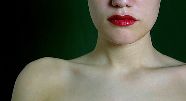
Ã�etta er ekki ólÃkt þvà að listamaður sé að mála portrett. Flottir litir (sérstaklega græni liturinn). Einföld form. Nánast eins og myndin sé ekki à ljósmynd. Mjög flott mynd. 10
Ps. kæmi vel út á striga |
|
|
|
05/26/2003 02:15:56 AM |
*Critique Club*
Strange that I got "Purple" also as a CC assignment.
I think I had suggested cropping the face in that shot, but I think in this one I'd like to see MORE of the face actually. Right in the middle of her head seems like a strange place for a crop. Especially when showing so much of the shoulders. While her shoulders may be pretty, I don't think they really need to be in this photo to work with the challenge. The white actually takes up more space than the green, which is suposed to be the main thing for the challenge. So, I think for this shot, I would show more head, less shoulders.
Focus and clarity are again really good. We can see the little creases in her lips. Great detail you show us here.
The lighting is good as well. No distracting hot spots or annoying shadows.
Again, I like how you have positioned her to the right of the photo, however, I think that I'd like the negative space to be more green for the purpose of the challenge. Outside the challenge, I think the background works very well.
I think that there is a great deal of white between the red and green, and I think that makes it seem like the shot isn't quite focused on the colors. Maybe making the green area of the background larger, and creating less skin would help to put the visual focus on the color and not nessisarily just the girl.
As for your poem, I'm not really sure I get it. But this line "Believe in me though u cannot c what lies within the Dark " Kind of makes me think that you were trying to make us look really hard for the green, which is partially hidden in the darkness. Maybe even TOO hidden.
~Heather~
|
|
Comments Made During the Challenge  |
|
|
05/25/2003 11:33:44 PM |
| I really like how the background contrasts with the lips here. This photo has a very formal feel to it. |
|
 Photographer found comment helpful. Photographer found comment helpful. |
|
|
05/24/2003 06:30:19 AM |
| is this the same face that did a pic for secondary colours called "Purple " last week ? |
|
| Photographer found comment helpful. |
|
|
05/23/2003 07:01:21 PM |
| Cool cropping, sensuous lips, nice shoulders. Is she married :-) |
|
| Photographer found comment helpful. |
|
|
05/23/2003 12:27:18 AM |
Here is what I see.
Meeting the challenge � I see the red only.
Since, you choice the RT ¼ side of photo as to show the red.
I feel there are two focus points � The lips and the Shoulder bones of subject.
Since half of her head is left out, I fell there is something missing for me.
I feel the lighting is done well for the pose.
This photo may have potential to be a good photo with a little something.
Not sure what.
=5 |
|
|
|
05/22/2003 10:35:35 PM |
| Hmm... What about the colors? Good sharp photo, but the skin is a little chalky. Maybe a little color toning would make it better. |
|
|
|
05/22/2003 04:54:26 PM |
| very interesting composition. Has a very "modern" abstract feeling to it. |
|
| Photographer found comment helpful. |
|
|
05/22/2003 03:17:46 PM |
| It took me a moment to discover any sort of complementary colour here, and there's far too much expanse of neutral colour between them to make it obvious. The off-center nature of the subject just makes it harder. The natural focus point of the center does not contain the complementary colours (assuming the focus is red/green, and not some sort of very subtle tan/blue vein thing), so you have to search for it. For a topic like this, I prefer a lack of subtlety. In other topics this photograph would probably have rated more highly with me. |
|
|
|
05/21/2003 03:50:49 PM |
| Simple. Very complementery! Could maybe have benefitted from better lighting! |
|
| Photographer found comment helpful. |
|
|
05/20/2003 09:31:34 PM |
| subtle green - obvious red. i like how they set eachother off. nice composition. might look interesting more high-key too. |
|
| Photographer found comment helpful. |
|
|
05/20/2003 06:53:20 PM |
| skin tone is a little green, but nice image. Effective contrast with the green background, and red lips |
|
| Photographer found comment helpful. |
|
|
05/20/2003 09:24:27 AM |
| nice subdued shot capturing the colors, well done to crop they eyes, draws you right to the lips flanked by the white of the skin and the dark green bg - 6 |
|
| Photographer found comment helpful. |
|
|
05/20/2003 08:57:59 AM |
|
| Photographer found comment helpful. |
|
|
05/19/2003 08:11:59 PM |
| I like the simplicity of this shot, but the green isn't noticeable enough. You should try to help bring it out a bit better to get your point across. |
|
| Photographer found comment helpful. |
|
|
05/19/2003 06:54:27 PM |
| not sure I really get the complimentary colour relationship here. The lips are really strong and the background is sort of greeny but only really slightly. Interesting composition/ cropping. |
|
| Photographer found comment helpful. |
|
|
05/19/2003 06:19:09 PM |
| This is a particularly interesting shot, but I think I'm missing the 'complementary colors' theme. The red is plain enough but I'm looking for the green to go with it... = 3 - update... I can see the green on my home monitor just fine... there is a green halo around the head and shoulders... my work monitor is not calibrated correctly... I believe that a little extra boost of light for the green in this photo would enhance it quite a bit overall.... = 6 |
|
| Photographer found comment helpful. |
|
|
05/19/2003 04:41:51 PM |
| nice picture. the skin comes through really nice, very real. very nice composition and lighting. |
|
| Photographer found comment helpful. |
|
|
05/19/2003 03:38:04 PM |
| That is some rrreeeddd lipstick. |
|
| Photographer found comment helpful. |
Home -
Challenges -
Community -
League -
Photos -
Cameras -
Lenses -
Learn -
Help -
Terms of Use -
Privacy -
Top ^
DPChallenge, and website content and design, Copyright © 2001-2025 Challenging Technologies, LLC.
All digital photo copyrights belong to the photographers and may not be used without permission.
Current Server Time: 03/12/2025 02:00:21 AM EDT.