| Author | Thread |
Comments Made During the Challenge  |
|
|
05/24/2003 11:17:15 PM |
| Simple idea that works. The light is a bit harsh and unfriendly. Good composition. |
|
 Photographer found comment helpful. Photographer found comment helpful. |
|
|
05/23/2003 06:17:04 AM |
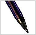
When I saw the title, I thought: 'Great! He or she switched the caps of the markers to make an allusion on the movie' ... and then I looked at the picture and I was a bit disappointed that I didn't find any reference of that idea. But.. it's a photography contest, and not a 'creative titling' contest, so I won't hold it against you, when scoring.
Technically speaking, I've got two remarks:
- the pens are not placed completely symmetrical. (Otherwise, if this was your intention, the difference between the two is not prominent enough.) It gives a kind of 'sloppy' impression.
- the background color doesn't match with the colors of the pens.
You've got good detail and sharpness, and the challenge is met very well (although not very creatively imho)
I hope that I not offended you with these comments. I honestly think you could do better than this. Regards, Marco. |
|
| Photographer found comment helpful. |
|
|
05/22/2003 10:32:05 PM |
| Good and simple, but the writing on the pens distracts a little. Very good color and sharpness |
|
| Photographer found comment helpful. |
|
|
05/22/2003 02:14:24 PM |
| This would have worked better for me if staged with, say, multiple Sharpies of each colour, or perhaps against a backdrop of coloured-in squares on a whiteboard, or something along those lines. As it is, it sort of feels like you picked the first couple contrasting coloured objects you had handy, stuck them next to each other, and gave up. |
|
| Photographer found comment helpful. |
|
|
05/22/2003 09:08:09 AM |
| seems that flash was used for this shot. it shouldn't have been used. try using external light source. |
|
| Photographer found comment helpful. |
|
|
05/21/2003 01:54:03 PM |
| The tight crop helps to "build tension" I think a different color of background would have been more effective. |
|
| Photographer found comment helpful. |
|
|
05/20/2003 06:00:11 PM |
| Good focus and meets the challenge but dull subject. |
|
| Photographer found comment helpful. |
|
|
05/20/2003 02:15:11 PM |
| Hey, I have those pens too. The green and red caps make this picture meet challenge. The colors are vivid and well portrayed. However, the subject matter and composition is rather boring. You possibly could have used the pen caps arranged in a different way with a more interesting background to meet the challenge and the picture being more pleasing to the eye. |
|
| Photographer found comment helpful. |
|
|
05/19/2003 07:02:13 PM |
| meets the challenge but doesn't have a lot of interest |
|
| Photographer found comment helpful. |
|
|
05/19/2003 03:48:33 PM |
| I wish it were brighter, and the background whiter. |
|
| Photographer found comment helpful. |
|
|
05/19/2003 03:41:13 PM |
| meets the challenge... interest level is a bit low for me... = 3 |
|
| Photographer found comment helpful. |
|
|
05/19/2003 06:03:54 AM |
| Harsh lighting - don't much like those very bright reflections. Also i think this kind of shot needs very careful setting-up. With no other subjects whatsoever, the not-quite-symmetrical positioning is distracting. |
|
| Photographer found comment helpful. |
Home -
Challenges -
Community -
League -
Photos -
Cameras -
Lenses -
Learn -
Help -
Terms of Use -
Privacy -
Top ^
DPChallenge, and website content and design, Copyright © 2001-2025 Challenging Technologies, LLC.
All digital photo copyrights belong to the photographers and may not be used without permission.
Current Server Time: 03/12/2025 04:52:52 PM EDT.