| Author | Thread |
Comments Made During the Challenge  |
|
|
08/28/2005 10:16:53 PM |
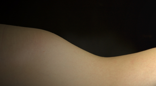
| Nice curves, nice lighting. |
|
 Photographer found comment helpful. Photographer found comment helpful. |
|
|
08/28/2005 07:50:39 PM |
| I like the graphic simplicity of your shot. |
|
| Photographer found comment helpful. |
|
|
08/27/2005 10:04:28 PM |
|
| Photographer found comment helpful. |
|
|
08/27/2005 07:46:23 PM |
| Might try rotating a bit to create a more powerful compostiton. |
|
| Photographer found comment helpful. |
|
|
08/27/2005 07:14:20 PM |
|
| Photographer found comment helpful. |
|
|
08/25/2005 02:24:59 PM |
| I like the idea, and considered submitting something like this myself. I think you need a stronger light source at a more acute angle to make it really work. if this were a landscape, you'd probably want to shoot at sunrise or sunset, right? think about where the light would be in such a case. |
|
| Photographer found comment helpful. |
|
|
08/25/2005 01:20:45 AM |
| I like abstracts. This needs better lighting. |
|
| Photographer found comment helpful. |
|
|
08/25/2005 12:50:12 AM |
| would work better with another body creating another curve |
|
| Photographer found comment helpful. |
|
|
08/23/2005 11:31:37 PM |
| Nice abstract. Imo, it would look better in b/w. Don't take this the wrong way, but this is like the ones of the men's feet. It doesn't feel as if the photographer was willing to risk much with the picture and was sidestepping the intent of the challenge. But that is only my opinion. |
|
| Photographer found comment helpful. |
|
|
08/23/2005 06:29:01 AM |
| curves indeed, nice skin tone and feeling of balance |
|
| Photographer found comment helpful. |
|
|
08/23/2005 12:53:22 AM |
| Yep - as an abstract, it looks good except for the (hips) curve on the left which flattens out a little at the top. Good lighting. |
|
| Photographer found comment helpful. |
|
|
08/23/2005 12:49:06 AM |
| I love these shots. I think the shot would have been better with more even lighting across her body. |
|
| Photographer found comment helpful. |
|
|
08/23/2005 12:11:57 AM |
| I really like the simplicity of this. I hope they score this really high. |
|
| Photographer found comment helpful. |
|
|
08/22/2005 11:20:45 PM |
| Well done technically, average compostion. IMHO. 6 |
|
| Photographer found comment helpful. |
|
|
08/22/2005 10:32:31 PM |
| Great idea but doesn't do anything for me...I can't really tell it's a body, or what part of the body. |
|
| Photographer found comment helpful. |
|
|
08/22/2005 10:08:33 PM |
I know what you are trying to do here and I can appreciate the attempt! Your lighting is not quite right though to make the form pop out of the frame. I am quite the novice myself so I can not offer any good advice on how to make this more effective except to say play around with it. Good job
TC |
|
| Photographer found comment helpful. |
|
|
08/22/2005 08:50:39 PM |
| Nice curve, very leading across the frame. The bg seems to too soft, at least for me; I'd like to see it completely black. Good luck! |
|
| Photographer found comment helpful. |
|
|
08/22/2005 06:49:50 PM |
| This is very cool. You could match it up with a guitar or something. Image is nicely balanced. I think B&w would work well as on my monitor the colour change goes into a greenish tinge on the left (Um maybe my monitor needs calibrating) |
|
| Photographer found comment helpful. |
|
|
08/22/2005 06:39:37 PM |
| Really nicely composed and cetainly a tasteful and flattering nude. Very well done |
|
| Photographer found comment helpful. |
|
|
08/22/2005 06:26:36 PM |
| this screams to me to be in b&W. It is my favourite curve, and i love the landsccape it creates/ |
|
| Photographer found comment helpful. |
|
|
08/22/2005 04:47:20 PM |
| The lighting is a little bland |
|
| Photographer found comment helpful. |
|
|
08/22/2005 03:13:43 PM |
| A lot like my entry in Nude I. Although I too am a fan of simple abstract subjects, I think you are stretching the envelope by limiting yourself to just the shape of the outline. I would have included at least some elements of skin texture, 3D shape defined by shadows, or possibly color contrast (with a non-black background). |
|
| Photographer found comment helpful. |
|
|
08/22/2005 02:30:51 PM |
| I like where you decided to split this image - the ying and yang thing works. What I am troubled by here is the lack of purpose. Ah - the title - abstract. Okay. I'm not sure the tones work for the best in an abstract sense. I would think that it should have a purpose - light against dark, color against shape, something. But I dont quite get that here. Maybe if it was black and white or maybe if the lighting gave more depth to the image. Honestly, I think this is a good start but to do well in this challenge you need to go a little further. 5 |
|
| Photographer found comment helpful. |
|
|
08/22/2005 12:57:58 PM |
| Nice idea, but if you are going to minimalistic, I think light directly skimming over the hip and waist would have given it a bit more snap. |
|
| Photographer found comment helpful. |
|
|
08/22/2005 02:48:15 AM |
| good abstract butmaybe just a little bit too abstract that itbegins to border boring compared to some of the other better shots in the challenge. |
|
| Photographer found comment helpful. |
|
|
08/22/2005 01:18:08 AM |
| I love abstract nude shots, though I feel that this could use a little extra something to offer a point of focus. As it is now, there is nothing to grab the eye's attention, so it feels lost. Maybe a wedding band or a rose petal? |
|
| Photographer found comment helpful. |
Home -
Challenges -
Community -
League -
Photos -
Cameras -
Lenses -
Learn -
Help -
Terms of Use -
Privacy -
Top ^
DPChallenge, and website content and design, Copyright © 2001-2025 Challenging Technologies, LLC.
All digital photo copyrights belong to the photographers and may not be used without permission.
Current Server Time: 03/14/2025 01:26:01 AM EDT.