| Author | Thread |
Comments Made During the Challenge  |
|
|
06/09/2002 09:35:00 PM |
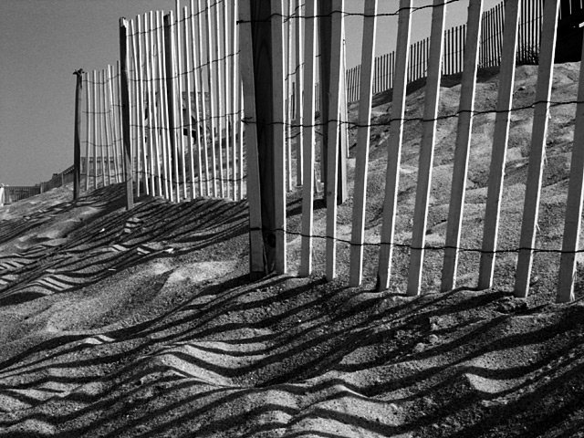
| has the right elements, but doesn't quite work. Need to isolate more and simplify the composition. Just the shadows on the sand could have been striking |
|
|
|
06/09/2002 04:57:00 PM |
| this picture would sell like hotcakes (what does that mean?!!) in my town, what with all of the tourists and those of us who appreciate good photos! The only thing I might have done differently is crop the far left to get rid of the house and only have the fence in the frame to focus on the cool lines and contrast. nice job. |
|
|
|
06/09/2002 02:28:00 PM |
| more of the dune and less of the fence. sand looks really nice in B&W |
|
|
|
06/09/2002 01:31:00 PM |
| Excellent use of black and white 10 |
|
|
|
06/09/2002 01:07:00 PM |
| I would have liked to have seen more of the shadows in the sand! |
|
|
|
06/09/2002 12:23:00 AM |
| Very cool use of shadows. I like how the breaks in the fence leave striped areas interspersed with sunny areas. The rounded softness of the sand also contrasts well with the straightness of the sticks. |
|
|
|
06/08/2002 02:18:00 PM |
| I really like this one. The effect of the straight lines on the pitted sand is neat. Would have been nice if you could have taken it from a perspective that didn't include the billboard and house...maybe include a little more beach to extend the line of sight. The house/privacy fence kind of stops the image abruptly for me. |
|
|
|
06/07/2002 07:59:00 PM |
Nice geometric quality...
Tones are very well done |
|
|
|
06/07/2002 02:14:00 AM |
|
|
|
06/06/2002 08:12:00 PM |
| I love the quiet drama here. |
|
|
|
06/06/2002 04:34:00 PM |
| A perfect B&W picture. The only 10 for me in this weeks challenge |
|
|
|
06/06/2002 12:11:00 PM |
| Check out the outdoor macro shot challenge. This is a nice shot of a dune, but it doesn't capture the beach as well as the macro shot did I feel. I would have preferred less depth of field. Overall good job. |
|
|
|
06/05/2002 11:33:00 PM |
| I lived it the top of a dune like that when I was in the second grade...we had the world's biggest sandbox (and lost a lot of shoes). |
|
|
|
06/05/2002 08:14:00 AM |
| good contrasts and an excellent viewpoint. I like this very much. |
|
|
|
06/05/2002 05:04:00 AM |
| Nice tonal range. Good work. |
|
|
|
06/04/2002 11:32:00 PM |
| This is a very good shot. I like it for two reasons: it really takes advantage of being a black and white image, and conveys an amazing mood. A stand out image for this week! |
|
|
|
06/04/2002 11:15:00 PM |
| I love lines... i especially love diagonals.. you have captured both in this image... good job! |
|
|
|
06/04/2002 09:50:00 PM |
| nifty! I wish the sand was a touch whiter, fence posts too - but I like it. good job. |
|
|
|
06/04/2002 04:50:00 PM |
| Very nice use of textures, patterns and shadows. Also, very good composition, but it seems just a touch dark to me. (I'll check on another monitor, later). |
|
|
|
06/04/2002 12:35:00 PM |
| I love the texture of the shadows on the sand. This is one of those photographs that works better in black and white than it would in color. |
|
|
|
06/04/2002 10:32:00 AM |
| like the shadow effect of the fence on the sand...neat. |
|
|
|
06/04/2002 09:49:00 AM |
| Oh, I wondered if anyone was going to do this. I like the high contrast. The repeating lines obviously give it interest, but even more so because of the wavy lines of the shadow sand ones. I might have cropped the black top right, but that's a nitpick. |
|
|
|
06/04/2002 03:16:00 AM |
| My dad made a bunch of dune fence pictures back in the early 70s. They make a great subject - geometrical blended with the organic curves of the dunes, good shadows, textures of wood and sand, etc. To work really well, though, it's important to isolate a pattern and focus on that. The houses in the bg and second fence just draw the eye away from what you're trying to show here. |
|
|
|
06/03/2002 09:01:00 PM |
| I really like the shadows of this photograph. The dark post comming out the center is a little distracting to me. |
|
|
|
06/03/2002 06:39:00 PM |
| Wow!! Great photo, excellent shadows. Perfect cropping. Superb job. |
|
|
|
06/03/2002 06:02:00 PM |
| An excellent exapmle of how to take an image for black and white. Geat use of light, shape and textures. Well done! |
|
|
|
06/03/2002 05:14:00 PM |
| Neat b&w. Love the texture of the fence/sand and shadows. Good job. |
|
|
|
06/03/2002 05:05:00 PM |
| The shadows do it for me... |
|
|
|
06/03/2002 04:16:00 PM |
| I keep coming back to this. Must be the combo of lighting, shadows, textures, and geometry. Good photo. A top 5. |
|
|
|
06/03/2002 01:47:00 PM |
|
|
|
06/03/2002 01:36:00 PM |
| One of my early favorites -- your use of lines vs. curves and a range of textures and tones is outstanding. Wonderful shot. |
|
|
|
06/03/2002 01:35:00 PM |
| Wow, the distortion of the shadows over the sand is wonderful. You have a great eye for detail. |
|
|
|
06/03/2002 12:51:00 PM |
| good composition, light. a little too contrasty or I'd give it a 9 |
|
|
|
06/03/2002 12:34:00 PM |
| Great shot, nice use of a shadows. |
|
|
|
06/03/2002 12:16:00 PM |
| Nice play with lines and shadows. |
|
|
|
06/03/2002 10:27:00 AM |
| Reminds me of Jones Beach |
|
|
|
06/03/2002 08:20:00 AM |
| great play of light and shadow |
|
|
|
06/03/2002 07:31:00 AM |
excelent
love the lines.. geometry and shadows |
|
|
|
06/03/2002 05:35:00 AM |
| good shoot just needed to get in the top of the fence railings closest to you |
|
|
|
06/03/2002 02:29:00 AM |
| Looks like the skin of zebra |
|
Home -
Challenges -
Community -
League -
Photos -
Cameras -
Lenses -
Learn -
Help -
Terms of Use -
Privacy -
Top ^
DPChallenge, and website content and design, Copyright © 2001-2025 Challenging Technologies, LLC.
All digital photo copyrights belong to the photographers and may not be used without permission.
Current Server Time: 04/26/2025 07:13:17 PM EDT.