| Author | Thread |
|
|
01/30/2004 08:06:04 PM |
another very nice black and white image...
soup
|
|
 Photographer found comment helpful. Photographer found comment helpful. |
|
|
05/31/2003 07:45:19 PM |
| The water and being b&w make this shot. It could have won as well as any of the shots ahead of it. |
|
| Photographer found comment helpful. |
|
|
05/28/2003 06:17:26 PM |
Journey, 'Pong, kiwiness, brentg3, BAMartin, e301, wingy, Allen, LeahStephen and basia03 and briphoto > Thanks for your insights and encouragement.
Message edited by author 2003-11-27 15:53:24. |
|
|
|
05/28/2003 02:46:36 PM |
> e301: thanks for your interest, e.
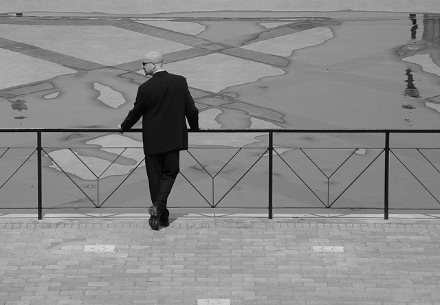
Thought processes? Thought, with me, usually starts after after the fact. Until then, the capture remains a kind of esoteric document, fit for study.
In this case, I had stumbled upon this brand new public waterfront facility, all swept clean and still relatively bare of people. What had struck me first, was the visual surreality created by the overtly neo-classicistic architecture combined with such eery vacancy. Since everything here was new and clean, textural and structural details felt emphasized with deliberate intent. Neither was I sure (at the time) whether the fountains were intended to spew or trickle (as they do in the photo). I thought, the trickling effect was very pretty and novel too, as a spectacle.
I positioned myself centrally on top of the stairs leading to the terrace and decided to wait for someone or something to walk, drift or fly into the picture. I knew I wanted a 'hard and true', full dof shot, dictated by the setting and the diffuse brightness of time and weather. Consequently, I used no filter, switched to Landscape mode and kept prefocusing, looking through the viewfinder with both eyes open. As is often the case with muses and miracles, they come when they come, and usually have a will of their own :-).
I 'chose' the 'soignee', mainly because he was there.
When I reviewed the shot, I thought of Neo (in the movie), 'neo' as pre-fix, the nature of coincidence and predisposition and noted with gratitude that the folds on the jacket and trousers were still discernible.
On the way home, I found myself pondering the epochal relevance of urban design in light of our dependency on visual stimuli.
:-)
|
|
|
|
05/28/2003 12:48:53 AM |
Zeuszen, congrats with this image. You finished quite well but i think you would have done better if some folks hadn't marked it down for 'not meeting the challenge yadayadayada'. I really like this shot which is way more important than doing something for a one time challenge.
Btw, also wanted to say thanks for the very insightful and eloquent comment you made the other day on a thread i started about provocation in art. |
|
| Photographer found comment helpful. |
Comments Made During the Challenge  |
|
|
05/27/2003 01:58:20 PM |
| nice job..it looks very real |
|
|
|
05/27/2003 08:21:23 AM |
| Wow, amazing photo, razor sharp and great shapes. Stretching the challenge a bit though... 5 |
|
| Photographer found comment helpful. |
|
|
05/25/2003 10:44:11 PM |
| This shot is cool and has a lot of power. It's a nasty image and i like that. The nice patterns of the puddles on the squared terrace really help this shot a lot. Think though that i would have cropped it at the top edge of the puddles to give it more of a reading that 'so is the world'. You'll probably get comments to move the guy slightly more to the left to agree with the rule of thirds but where you have just blends in beautifully with the pattern of the puddles which was probably what you were going for. Good choice of B&W. Technically, this is not the best shot among the submissions but this image has a lot of eeriness to it and to me, much more than all those sunglasses and blue and red pills, says Matrix to me (mind you though that i didn't see the movie :) 9 |
|
| Photographer found comment helpful. |
|
|
05/24/2003 10:49:47 AM |
| The background gives so much to the picture and using b/w is a good choice. |
|
| Photographer found comment helpful. |
|
|
05/23/2003 05:06:55 AM |
| Very clear and focused. This photo along with the title tells me a story, very good! |
|
| Photographer found comment helpful. |
|
|
05/23/2003 04:42:14 AM |
This is one of these shots, that I cant tell you exactly why I like it... but I do... a lot!!!
I think the strong lines and contrast between the strong straight lines and the water marks being anything but straight!!
GREAT JOB! |
|
| Photographer found comment helpful. |
|
|
05/22/2003 06:14:02 PM |
| Not sure how this says "Matrix" but it's a good picture. B&W was a good choice. |
|
|
|
05/22/2003 02:37:32 PM |
| This is my choice for the blue ribbon. Very well done. |
|
| Photographer found comment helpful. |
|
|
05/22/2003 12:20:33 PM |
I;ve had to by-pass this shot twice while voting - I just can't make up my mind about it. Technically obviously completely accomplished. Artistically and compositionally ... hell, I don't know. I like the railings, the criss-cross patterns on the concrete beyond, the foreground brickwork, the very 'square' composition and the way it's broken up by those lines. Don't like the lighting much - whilst I guess it has helped the cleanness of those compositional lines, it's killed texture in any of those areas (I guess that is deliberate) and in the figure's suit. Like the pose, but it bothers me a lot that he's looking out of frame on the short side - ie why not have him looking right? This gives the idea to me that there is something going on that way that's deliberately excluded - I'd have placed him either to the right of the frame, or looking the other way. One more thing is the reflections in the top right corner/edge - they introduce an much more organis form into the image, and it doesn't seem quite in place.
Blimey, this has gone on a bit. really intersting shot, but there's something I don't like about it, and I'm clutching at straws. I'd love to know what the thought processes were. |
|
| Photographer found comment helpful. |
|
|
05/21/2003 11:31:13 PM |
| Good choice with the black and white.. the patterns and lines in this shot come out from all over and create a very slick scene. The water adds the perfect touch to the shot by mixing up the patterns and structure. 9 |
|
| Photographer found comment helpful. |
|
|
05/21/2003 01:33:57 PM |
| nice idea i like the balck and white idea to this picture it was done very nicely good work |
|
| Photographer found comment helpful. |
|
|
05/21/2003 08:12:36 AM |
| Wow, that guy is a dead ringer for an agent. I absolutely LOVE how the cement in front of him makes X's, and has water on it... and how the fence makes V's. Very good photo, I hope it makes it to the top 3! |
|
| Photographer found comment helpful. |
|
|
05/21/2003 08:12:25 AM |
| nice photo, a bit weak on theme though. |
|
|
|
05/21/2003 08:06:58 AM |
| great graphic quality in this picture! 8 |
|
| Photographer found comment helpful. |
Home -
Challenges -
Community -
League -
Photos -
Cameras -
Lenses -
Learn -
Help -
Terms of Use -
Privacy -
Top ^
DPChallenge, and website content and design, Copyright © 2001-2025 Challenging Technologies, LLC.
All digital photo copyrights belong to the photographers and may not be used without permission.
Current Server Time: 04/01/2025 06:59:03 PM EDT.