| Author | Thread |
Comments Made During the Challenge  |
|
|
06/01/2003 03:52:08 PM |
| As someone who is afraid of heights, this is dizzy-ing. It seems a little muted to me, maybe a bit more contrast? |
|
|
|
05/31/2003 09:59:48 PM |
| This is great - definately has a "wow" factor! Good job. |
|
|
|
05/31/2003 12:35:50 PM |
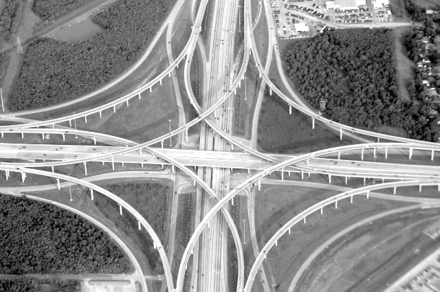
| looks like our spaghetti junction in Atlanta! Excellent shot and good use of contrasts and curves. thanks |
|
|
|
05/31/2003 08:54:38 AM |
| Big highway junctions are fascinating works of engineering. You've shown the subject from an interesting viewpoint. I'm wondering if it would have looked even better with the four roads disappearing into the corners of the shot. I find the lack of trees in the bottom corner draws my attention out of the shot, towards the bottom right corner, which unfortunately also happens to be quite blurry. Corner of the plane window? |
|
|
|
05/29/2003 07:07:40 PM |
| Nice composition, I like the abatract nature of the shot. Is the slight blurring to bottom right due to jet exhaust? I've experinced this on some of my aerial shots. |
|
|
|
05/29/2003 10:00:48 AM |
| A tiny bit crisper focus here might have gotten a ten from me; as it is, it's still a fascinating subject, laid out to look almost like a cathedral rose window. |
|
|
|
05/28/2003 05:43:53 PM |
| You can see the reflection of the plane window on the right upper side of the photo, I don't feel there is enough contrast in this photo... it also looks fairly lopsided. Interesting pattern though. |
|
|
|
05/27/2003 08:45:07 AM |
| Hmm. I think in this case, centering the center of the structure might have worked better; I feel a little dizzy looking at this one. The lighting may be a bit too bright for a duotone, it feels a bit washed out. |
|
|
|
05/26/2003 04:17:49 PM |
| Good job. How did you do that ...don't see too many straight down arial shots like that. IInteresting subject. Jacko. 8 |
|
|
|
05/26/2003 01:56:50 PM |
| looking forward to reading how you took this one! personally I would probably have darkened this a bit and added a bit more contrast to really make the lines jump off the screen...... good luck, Todd. |
|
|
|
05/26/2003 01:15:11 PM |
| Where were you to take this shot?! |
|
|
|
05/26/2003 08:59:33 AM |
| How'd you GET here to take this!!?? Nice shot! |
|
Home -
Challenges -
Community -
League -
Photos -
Cameras -
Lenses -
Learn -
Help -
Terms of Use -
Privacy -
Top ^
DPChallenge, and website content and design, Copyright © 2001-2025 Challenging Technologies, LLC.
All digital photo copyrights belong to the photographers and may not be used without permission.
Current Server Time: 03/12/2025 10:54:18 PM EDT.