| Author | Thread |
|
|
09/08/2005 01:16:02 PM |
Greetings from the Critique Club!!!
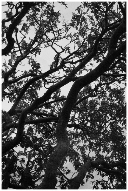
Initial impact: Hmm pretty. Not a high impact image but it does remind me of an oriental ink print or somthing of the sort.
Meeting the challenge: Sure it meets the commonly accpeted definition of the challenge. But not mine personaly. I feel that without the title that this image and most others in the challenge would have trouble holding up. So this is just a matter of personal taste. After all I felt the same about the 1st and second place shots as well.
Color: Well there realy is not much to say in this area. Other than I feel that using B&W was a great decision in this case.
Contrast: WOW!! You definately have a great start on that one. I would like to have seen whiter whites and blacker blacks. If you had managed to get the contrast and details in the leavs and trunk as well you would have had a real trophy shot with this one.
Lines: I feel that your diagonal lines work well in this shot. It gives a dull subject a bit of spice. I feel that it was also a good choice to leave the ends of the branches towards the top of the photo. This gives you a feeling of streagnth and foundation.
Composition: To some extent this follows the rule of thirds. However when you suject ecpompasses the entirty of the of the screen it is not necessary to follow the rule of three. I feel that this composition works well. You managed to completely fill the space which in a shot like this is perfect.
Lighting: Perhaps a small amount of lighting from ground level would have helped. While not necessary it might have assisted in bringing out more of the details.
Overall: Nice photo. I think that you main downfall for this was simply detail. With a little post processing work to bring out the details and tweek the contrast this 4.4 would easily have been a 5.4 or possibly better.
Best of luck in all of your future challenges
Tristalisk
|
|
Comments Made During the Challenge  |
|
|
09/02/2005 10:09:48 PM |
| i like this more when i turn it 90 degrees ccw. in that version my eyes scan from right to left but the branches sweep against them in the other direction making the view much more interesting to me. here my eyes seem to stay with the main 2 branchs. not sure what your intent was, but thanks for sharing it. |
|
|
|
09/02/2005 06:14:13 PM |
| Nice high contrast shot.... Funny it would work for this challenge, high contrast, and branch!!! Very versatile image |
|
|
|
09/02/2005 03:44:33 PM |
| A bit too shadowy - that is, there is so much tree that the sillouette gets lost in the dark. |
|
|
|
09/02/2005 11:12:13 AM |
| On topic, great pattern. Good clarity and the Black and White effect works for this photo |
|
|
|
09/01/2005 07:36:03 AM |
| You have met the challenge well with a high contrast pic. A shot up through the trees is a good concept. I think it is a bit clustered though. Mabey less branches and bigger spaces in between may look better. |
|
|
|
08/31/2005 11:47:13 PM |
| simple images I like, not enough contrast between dark and light in imo.......4 |
|
|
|
08/30/2005 12:11:00 PM |
| This could be interesting as an abstract...A couple things I might address would be the "flatness" of the light and lack of detail in the branches...maybe try playing around with the contrast, maybe some levels adjustments and a bit of dodging? I do see some detail in the branches but yearn to see a bit more...more depth and dimension perhaps. |
|
|
|
08/30/2005 02:55:48 AM |
| The abstract pattern is somewhat interesting, but it feels slightly imbalanced and suffers from the lack of a clear point of interest. |
|
|
|
08/29/2005 06:42:21 PM |
|
|
|
08/29/2005 05:13:53 PM |
| This works pretty well as an abstract. |
|
|
|
08/29/2005 12:01:56 PM |
| I'm not seeing so much of the "light" in here. The white areas appear more gray to me without a lot of brightness. |
|
Home -
Challenges -
Community -
League -
Photos -
Cameras -
Lenses -
Learn -
Help -
Terms of Use -
Privacy -
Top ^
DPChallenge, and website content and design, Copyright © 2001-2025 Challenging Technologies, LLC.
All digital photo copyrights belong to the photographers and may not be used without permission.
Current Server Time: 03/12/2025 01:21:02 AM EDT.