DPChallenge: A Digital Photography Contest You are not logged in. (log in or register
 
Challenge Entries
Portfolio Images
This image is not part of a public portfolio.
Frog and Sun Contrast
4ROGGYCHEF


Photograph Information Photographer's Comments
Challenge: High Contrast (Advanced Editing IV)
Camera: Nikon D50
Location: home
Date: Aug 30, 2005
Aperture: f4.2
ISO: 400
Shutter: 1/60
Galleries: Digital Art
Date Uploaded: Aug 30, 2005

N/A

Statistics
Place: 187 out of 343
Avg (all users): 5.3263
Avg (commenters): 7.8000
Avg (participants): 5.2098
Avg (non-participants): 5.5054
Views since voting: 998
Views during voting: 325
Votes: 236
Comments: 7
Favorites: 0


Please log in or register to add your comments!

AuthorThread
09/15/2005 11:40:49 AM
I have learned so much here. Funny thing, not much thought went into this photo. The sun is a wierd candle holder from Arizona and the frog is a garden element, I guess. They are both perched on my mantle right above my computer. They just so happen to be my favorite things.
09/15/2005 06:55:33 AM
Greetings from the Critique Club!
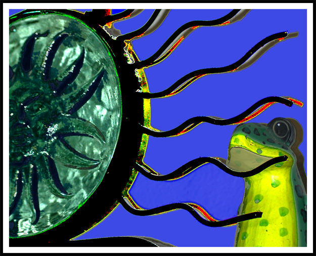
This is a spectacular image, and certainly loaded with all sorts of contrasts ... there's contrasting colours, contrasting tones, and even a contrast between the two subjects (maybe that one was your intended primary contrast, given the title). I am particularly pleased to have the chance to consider and review this image in detail because it is the sort of photograph that usually doesn't appeal to me on first impression (I'm not a fan of photos of toy ducks, gnomes, frogs, etc). However, a few moments' study reveals some very impressive qualities, and forces me to eat my words. First, the composition ... it's really very good indeed. Not just because of the relative weight you've given your two subjects, but also because you have managed to suggest a genuine relationship between the frog and the sun's warming rays. The hint of strong yellow light on the edge of the sun is powerfully reflected on the frog's chin & belly. It's more than just cute, its very clever. Next the actual photograph ..it's technically very sound; clean, accurately exposed, sharp and with nicely balanced colours. Finally, the processing ... it's here that I think you've stumbled just a little bit, and probably because you were so keen to emphasise the High Contrast theme; I think the tonal contrast is just a bit too strong, and perhaps it's sharpened a little too much as well. Overall, a very nice image that taught me a worthwhile lesson about hasty judgements.
Cheers
Paul Martin
 Comments Made During the Challenge
09/11/2005 10:10:03 PM
Good contrasting photo. Bumping up after second look....ribbit.
09/11/2005 02:02:14 PM
little too much post processing here. I like the compostion. so it is really a shame.
09/07/2005 10:20:03 PM
That is serious contrast, its nice to see differnt shots!
09/05/2005 12:23:12 PM
Wow - fantastic color contrasts. Beautiful composition for a very appealing image. Nice job.
09/05/2005 01:03:06 AM
This is great. The vibrant colors are so clear - nicely executed!!!
  Photographer found comment helpful.


Home - Challenges - Community - League - Photos - Cameras - Lenses - Learn - Help - Terms of Use - Privacy - Top ^
DPChallenge, and website content and design, Copyright © 2001-2025 Challenging Technologies, LLC.
All digital photo copyrights belong to the photographers and may not be used without permission.
Current Server Time: 03/12/2025 02:43:41 AM EDT.