| Author | Thread |
|
|
09/15/2005 02:04:21 PM |
*Critique Club*
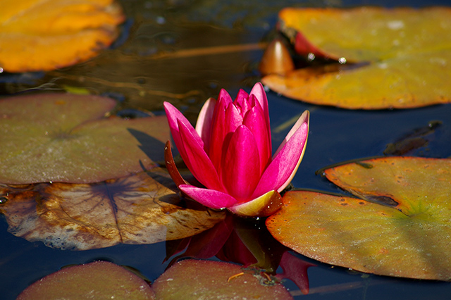
The first thing that I notice here is what others have mentioned already is the centered flower. I think this would be better with some dramatic angle or by placing the flower off center a bit. This would create some added interest that might hold the viewer in for a bit longer.
Next thing I see is that while it's a good shot, it's not exactly high contrast either. There is contrast in the photo, but not 'high' by my personal standards. Everyone is different in that aspect, I believe, but this is just my personal opinion.
What happened here, is you took the photo and added the contrast in post processing. I think had you taken the photo with high contrast in mind, and then post processed to ENHANCE your vision, that this might have faired better.
Focus and clarity on the subject seem good and we get some great detail in the flower and lily pads as well.
The upper left area in the water looks odd. It's a distraction. Not sure if it's reflection, or what, but it looks quite odd there at the bottom of that upper left lily pad.
Overall a pleasing image that could benefit from a different crop/angle.
~Heather~ |
|
 Photographer found comment helpful. Photographer found comment helpful. |
Comments Made During the Challenge  |
|
|
09/11/2005 09:15:38 AM |
| Beautifully composed and chosen shot. Excellent choice for contest. |
|
| Photographer found comment helpful. |
|
|
09/11/2005 01:22:54 AM |
| Some contrast. Lacks the "wow" of other entries in the challenge. maybe think about cropping it so the main focus isn't dead center in the photo. |
|
| Photographer found comment helpful. |
|
|
09/09/2005 09:03:18 AM |
| lovely combination of colors and light. composition is a bit static because of the central flower, one of my favorites this challenge |
|
| Photographer found comment helpful. |
|
|
09/05/2005 06:30:19 PM |
| Simply gorgeous in it's rich tonality and simple layout. Very beautiful image indeed. 9 |
|
| Photographer found comment helpful. |
|
|
09/05/2005 12:15:30 PM |
| Lovely rich tones and contrast. Nice reflection too. My only suggestion would be to take the flower out of the center. Very nice shot. |
|
| Photographer found comment helpful. |
|
|
09/05/2005 05:39:14 AM |
| The composition is too central. Not High contrast. |
|
Home -
Challenges -
Community -
League -
Photos -
Cameras -
Lenses -
Learn -
Help -
Terms of Use -
Privacy -
Top ^
DPChallenge, and website content and design, Copyright © 2001-2025 Challenging Technologies, LLC.
All digital photo copyrights belong to the photographers and may not be used without permission.
Current Server Time: 04/26/2025 11:40:57 AM EDT.