| Author | Thread |
|
|
09/13/2005 04:38:22 PM |
| Thanks for your comments on my photos... & I DO have a Brown Ribbon, so you can not top that with this photo... I am always leary to over process photos for fear they will be DQ'ed. I have to be honest with you, I did not rate this photo high (3) because I tend to vote higher for works that resemble photos... I know I am wrong, and try to be open minded, because this is a digital work of art (and it originated in a camera). I guess since I am a novice Photoshop user, that is my main hangup. If I had more experience and expertise in Photoshop, perhaps I would be more open minded to new and different techniques.... I am trying to improve with that aspect of my experience... |
|
 Photographer found comment helpful. Photographer found comment helpful. |
|
|
09/12/2005 09:34:41 AM |
| I have to admit, it hurt my eyes to look at this: BUT I DIDN'T CARE! I wanted to do something totally different and out of the box and wildly creative and that's what I'm proud of: myself for being willing to take a chance. thank you for the three 10s, one 9, and all the 5 to 7s..thanks for looking beyond the basics and into the wild world. |
|
Comments Made During the Challenge  |
|
|
09/11/2005 11:59:44 PM |
|
| Photographer found comment helpful. |
|
|
09/11/2005 10:24:39 PM |
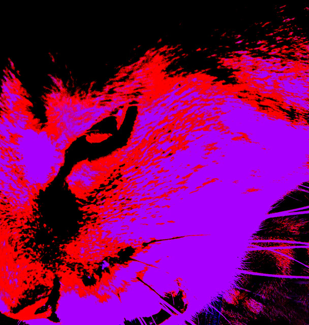
| Your filtering treatment gives this feline a really wild look. While you definitely achieved high contrast, I'm just not real crazy on it. Makes me think of a blacklit poster. |
|
| Photographer found comment helpful. |
|
|
09/11/2005 10:24:28 PM |
| Whilst I rather like this, I chose to vote quite low as it's gone too far beyond "photo" for the context of DPC, to me. |
|
| Photographer found comment helpful. |
|
|
09/11/2005 10:18:37 PM |
this makes my eyes bleed.. not pleasing at all
|
|
| Photographer found comment helpful. |
|
|
09/10/2005 09:45:39 AM |
| This doesn't really work for me. It has interesting shapes and colours and it is recognisable. It also has an angry feel to it, but it seems too overprocessed to me. 7. |
|
| Photographer found comment helpful. |
|
|
09/10/2005 01:20:47 AM |
| This really needs Day-Glo inks and a blacklight to achieve the full effect : ) |
|
| Photographer found comment helpful. |
|
|
09/09/2005 11:56:31 PM |
| Wow that is serious contrast, not sure about the colors but good job. |
|
| Photographer found comment helpful. |
|
|
09/09/2005 08:09:25 AM |
| Kind of a cool abstract. I think if you could get just a little more definition and detail, could make for a stronger presentation. |
|
| Photographer found comment helpful. |
|
|
09/07/2005 08:07:21 PM |
| If the purple were red I think you could have pulled something pretty cool off. I think the red and purple clash too much. Contrast yes, but not in a good way. |
|
| Photographer found comment helpful. |
|
|
09/07/2005 10:28:49 AM |
| IMO the solarized effect takes away from the shot, but that is a personal style issue. Love the eyes and whiskers.....especially those eyes - nice job. |
|
| Photographer found comment helpful. |
|
|
09/06/2005 11:30:29 PM |
| Too heavily processed, the image becomes lost in the colors. Have a hard time even seeing the cat. |
|
| Photographer found comment helpful. |
|
|
09/06/2005 04:54:37 PM |
| whoa, that one scary cat. A bit too much darkroom for me. |
|
| Photographer found comment helpful. |
|
|
09/06/2005 10:06:44 AM |
|
| Photographer found comment helpful. |
|
|
09/06/2005 08:52:15 AM |
|
| Photographer found comment helpful. |
|
|
09/05/2005 09:51:17 PM |
| Easy on the MS Paint filters! |
|
| Photographer found comment helpful. |
|
|
09/05/2005 07:41:08 PM |
| I like the idea you had here - and I'm a big supporter of thinking outside the box - but I'm not sure this works for me. Perhaps if you changed the overall hue, because I like the crop. |
|
| Photographer found comment helpful. |
|
|
09/05/2005 06:35:26 PM |
| While certainly high contrast, I'm afraid that this image left me a bit cold. I actually like many highly processed images, but this one didn't work for me. Sorry. |
|
| Photographer found comment helpful. |
|
|
09/05/2005 12:09:02 PM |
| Mmmm . . .I think this would have been better with different colours. |
|
| Photographer found comment helpful. |
|
|
09/05/2005 10:26:15 AM |
| Sorry - I just don't like this... seems to be contrast for the sake of contrast. |
|
| Photographer found comment helpful. |
|
|
09/05/2005 09:10:24 AM |
You have chosen red and magenta as your contrasting colours. Technically cyan contrasts with red and green contrasts with magenta.
However you have produced a striking pic in a unique style - not to my taste but an interesting take on the challenge, good luck |
|
| Photographer found comment helpful. |
Home -
Challenges -
Community -
League -
Photos -
Cameras -
Lenses -
Learn -
Help -
Terms of Use -
Privacy -
Top ^
DPChallenge, and website content and design, Copyright © 2001-2025 Challenging Technologies, LLC.
All digital photo copyrights belong to the photographers and may not be used without permission.
Current Server Time: 03/14/2025 05:10:07 PM EDT.