| Author | Thread |
|
|
09/17/2005 09:25:03 PM |
Greetings from the Critique Club!
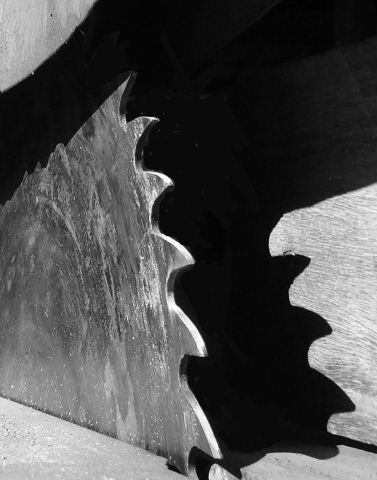
This is a very interesting shot, it really makes me look twice at it and then even a third or fourth time. The use of grayscale is very well done. But the lack of contrast is probably what hurt it overall in the challenge. If I had time to vote I would have probably given this a 6 or 7 for creativity but not much higher because the contrast is just not quite there. I see lots of gray and black but no definitive white.
Also the upper left corner is a bit distracting, maybe if you cropped the top lower to take out the curved area, it takes away from the sharp edges of the rest of the shot. I really like the idea and the overall composition of the shot. Well done overall.
Deannda |
|
Comments Made During the Challenge  |
|
|
09/11/2005 09:26:54 PM |
| I like the black shadows. Nice contrast areas. |
|
|
|
09/11/2005 08:14:42 AM |
| Not enough highlight for me. Nice textures. 8. |
|
|
|
09/10/2005 01:27:47 AM |
| Great contrast, nice thinking! |
|
|
|
09/06/2005 09:35:54 AM |
| very nicely composed. really like the detail and the shapes in this. |
|
Home -
Challenges -
Community -
League -
Photos -
Cameras -
Lenses -
Learn -
Help -
Terms of Use -
Privacy -
Top ^
DPChallenge, and website content and design, Copyright © 2001-2025 Challenging Technologies, LLC.
All digital photo copyrights belong to the photographers and may not be used without permission.
Current Server Time: 03/12/2025 08:24:09 PM EDT.