| Author | Thread |
|
|
09/13/2005 12:16:16 AM |
CRITIQUE CLUB CRITIQUE
by karmat
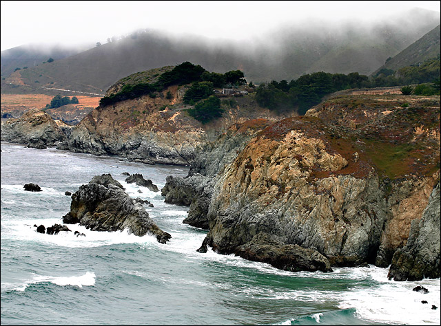
Nice landscape shot. I like the contrast between the sky/land/and sea. It might be interesting to reshoot on a day when it is not quite so stormy looking, just to get further contrast between the rugged terrain and less stormy looking water.
The thing I notice immediately about this shot is how it feels like it is tilted to the right. I understand it is the perspective of the shot, but it is not diagonal enough to act as a pseudo-leading line, but not straight enough to feel on level. You could try rotating it some to the left, but I am afraid that would make the upper half of the horizon feel kiltered. Perhaps if there were "more" on the left and right, and the viewer could get a definite feeling of an "s" curve of the shore line it would feel more level.
The mist adds a mystical feel to the shot, and adds to the overall mood. The rocks look a little "off" focus (not really out of focus, but not clear, either) which makes the shot lack a bit of depth that it could possibly have.
Overall, I think it is a pretty good shot with some interesting details and stormy mood. Good capture.
karmat |
|
 Photographer found comment helpful. Photographer found comment helpful. |
Comments Made During the Challenge  |
|
|
09/11/2005 06:02:38 PM |
| Some nice contrast here and there, unfortunately the mist tends to subdue the overall contrast...for me at least. |
|
| Photographer found comment helpful. |
|
|
09/11/2005 01:57:04 AM |
| Beautiful landscape scene, excellent composition, and good contrast - a great example of high contrast in color...8 |
|
| Photographer found comment helpful. |
|
|
09/10/2005 06:06:44 PM |
| good use of color contrast, love the fog in background |
|
| Photographer found comment helpful. |
|
|
09/10/2005 01:25:44 AM |
| Great contrast the rock are amazing to look at. |
|
| Photographer found comment helpful. |
|
|
09/09/2005 07:26:19 PM |
Fit Challenge Criteria: 2/2
Color/Contrast: 2/2
Composition: 2/2
Photo Quality: 2/2
My Subjective Affinity: 1/2 |
|
| Photographer found comment helpful. |
|
|
09/09/2005 01:51:44 PM |
| colors and textures are lovely-- I think this would have been more powerful if you cropped the sky out, as well as some off the right and a little bit off the left and bottom, focusing on the rocks and surf. |
|
| Photographer found comment helpful. |
|
|
09/07/2005 07:57:46 PM |
| Not bad. Seems a little overprocessed (too much sharpening on the left portion of the picture) and it doesn't scream "contrast" to me....liquid vs rock maybe? Not quite sure what you were after with this one. |
|
| Photographer found comment helpful. |
|
|
09/06/2005 12:39:15 PM |
| Great photo! Great colors! Is this your backyard? lol Can I come over for your next barbeque? |
|
| Photographer found comment helpful. |
|
|
09/06/2005 04:09:48 AM |
| Beautiful picture. It kind of has a 3D look. Great use of contrast. I really like the colors. Good job. |
|
| Photographer found comment helpful. |
|
|
09/05/2005 12:31:08 PM |
| Beautiful rich tones and great focus. The tilted angle bothers me a bit, but otherwise great shot! |
|
| Photographer found comment helpful. |
|
|
09/05/2005 01:07:48 AM |
| Beautiful coastline shot. I love the craggy rocks with the soft of the fog. Nice!!! |
|
| Photographer found comment helpful. |
|
|
09/05/2005 12:50:54 AM |
| Nice photo, but not sure what is the high contrast here. |
|
| Photographer found comment helpful. |
|
|
09/05/2005 12:37:56 AM |
| pretty, but I can't really see the contrast. looks a bit crooked too. 4 |
|
| Photographer found comment helpful. |
Home -
Challenges -
Community -
League -
Photos -
Cameras -
Lenses -
Learn -
Help -
Terms of Use -
Privacy -
Top ^
DPChallenge, and website content and design, Copyright © 2001-2025 Challenging Technologies, LLC.
All digital photo copyrights belong to the photographers and may not be used without permission.
Current Server Time: 03/14/2025 03:53:37 AM EDT.