| Author | Thread |
Comments Made During the Challenge  |
|
|
09/11/2005 10:19:29 PM |
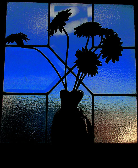
very nice, though it seems slightly tiled to the right...
|
|
 Photographer found comment helpful. Photographer found comment helpful. |
|
|
09/11/2005 10:06:36 PM |
| I like the silhouette and colors. I wonder what this would look like with more of the black cropped off of the bottom? |
|
| Photographer found comment helpful. |
|
|
09/10/2005 08:41:51 PM |
| Would have liked to have seen the photo squared up with the frame a little more, but good anyway. 7 |
|
| Photographer found comment helpful. |
|
|
09/10/2005 10:22:57 AM |
| Nice shot...great colors. Beautifull image |
|
| Photographer found comment helpful. |
|
|
09/10/2005 01:43:47 AM |
| Great lighting in the shadows. |
|
| Photographer found comment helpful. |
|
|
09/06/2005 03:32:55 PM |
|
| Photographer found comment helpful. |
|
|
09/05/2005 10:48:34 PM |
| I feel like this would be stronger if there were not overlapping lines. |
|
| Photographer found comment helpful. |
|
|
09/05/2005 07:24:02 PM |
| Vibrant shot. The slight tilt of the perspective is a bit distracting IMHO, but I like the colors and idea otherwise. |
|
| Photographer found comment helpful. |
|
|
09/05/2005 12:43:34 PM |
| Nice subject and composition. But IMO, the clouds and blurry lower window parts distract hugely from the subject. Also the texture of the left middle window pane is washed out. |
|
| Photographer found comment helpful. |
Home -
Challenges -
Community -
League -
Photos -
Cameras -
Lenses -
Learn -
Help -
Terms of Use -
Privacy -
Top ^
DPChallenge, and website content and design, Copyright © 2001-2025 Challenging Technologies, LLC.
All digital photo copyrights belong to the photographers and may not be used without permission.
Current Server Time: 03/14/2025 06:08:51 AM EDT.