| Author | Thread |
|
|
09/17/2005 10:10:32 PM |
Greetings from the Critique Club!
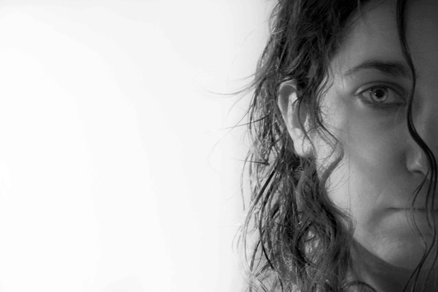
This is a very interesting shot. I like the use of negative space used on the left, adding the white for your contrast. But on the left you really have more grays than any set black, not really offering anything for the High part of the contrast.
The face on the left has a very good expression, it really fits the shot overall. The softness works well and the hair strand right on the edge is also a great touch. A bit more darkness on that side would really make this shot jump out.
Hope my comments help.
Deannda |
|
Comments Made During the Challenge  |
|
|
09/11/2005 01:46:45 PM |
| to me this is the opposite of HC you have covered a full range of grey tones. |
|
 Photographer found comment helpful. Photographer found comment helpful. |
|
|
09/11/2005 01:41:30 AM |
| The contrast in this shot is actually quite low. It's mostly a mid-tone gray excluding the background. |
|
| Photographer found comment helpful. |
|
|
09/10/2005 08:58:27 AM |
| Nice shot. Focus is a little off - although it could be my monitor. Like the high key effect. Maybe a little more shadow on the far side of the face? 9. |
|
| Photographer found comment helpful. |
|
|
09/10/2005 12:53:35 AM |
| She's going to kill me, isn't she? |
|
| Photographer found comment helpful. |
|
|
09/09/2005 09:52:19 PM |
| Love the eye and the tendril coming over her nose. I think you could make this have more pizazz by playing with curves and working with the contrast. |
|
| Photographer found comment helpful. |
|
|
09/09/2005 09:07:03 AM |
| you and your model have captured the moment perfectly. one of my favorites this challenge |
|
| Photographer found comment helpful. |
|
|
09/09/2005 05:26:16 AM |
| This is a cool composition. Good take on a classic. Seems like focus could be a little bit sharper, the eye just doesn't seem to really 'cut' through. For high contrast, I am thinking maybe a slight boost to your darks, by maybe a levels or curves adj. , could strengthen the presentation some. |
|
| Photographer found comment helpful. |
|
|
09/08/2005 04:06:26 PM |
| The composition is daring and very interesting, but the contrast is not very high on the face and hair of the model. The eye, however, is indeed well contrasted. |
|
| Photographer found comment helpful. |
|
|
09/07/2005 06:56:54 PM |
| I love the lighting and the crop. For the main subject to be the eye (per your title), I'd like to see it a tad sharper -- the eye, I mean. :) 7 |
|
| Photographer found comment helpful. |
|
|
09/05/2005 11:10:01 PM |
| I think this is borderline high contrast, but I'll give you credit. I like the negative space in the picture. 6 |
|
| Photographer found comment helpful. |
|
|
09/05/2005 07:42:19 PM |
| For me, while there is some contrast, the gray values of the model are very similar and not dramatic as compared to others in this challenge. Again for me, the white is almost overpowering, but I do like your composition. |
|
| Photographer found comment helpful. |
|
|
09/05/2005 12:21:01 PM |
| I like the concept, which is very striking, but would this have benefited from a little sharper focus on the eye? |
|
| Photographer found comment helpful. |
|
|
09/05/2005 01:16:49 AM |
| this is really cool. Okay, its late, my vocabulary is limited. Don't care for that much negative space but I think it works for the most part. Don't like the title but with the voters, I can see why you went there. Soft but not badly so. 7, will probably bump once I've been through everything else. |
|
| Photographer found comment helpful. |
Home -
Challenges -
Community -
League -
Photos -
Cameras -
Lenses -
Learn -
Help -
Terms of Use -
Privacy -
Top ^
DPChallenge, and website content and design, Copyright © 2001-2025 Challenging Technologies, LLC.
All digital photo copyrights belong to the photographers and may not be used without permission.
Current Server Time: 03/16/2025 09:56:50 PM EDT.