| Author | Thread |
|
|
09/20/2005 12:34:35 PM |
Greetings from the Critique Club
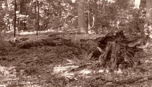
The signs of decay in nature can be a good source for photography. Stumps, fallen trees, forest growth, ground cover all work to make interest in a photo. It is good that you are able to recognize that your photography can grow. Do not let these results detract you from continuing your quest.
Let me give you a few suggestions that may help your photo.
1. Color/Tonal Range: The coloration may add to a photo in post-processing, but what has happened here is that it has made everything blend into itself and there are no real distinction between your subject (the fallen tree) and the background/surroundings. A real black and white conversion with more contrast would help.
2. Picture Size: Hard to make out the details in small pictures, and when you make them smaller than what they can be makes it even harder to see and judge the details in the photo. The width of this image is 498 pixels, when the maximum allowed is 640 pixels.
3. Lighting: Now it is an outside picture, am I supposed to bring out the lights and reflectors, etc... No. With this picture, being fairly wide, and in the shade, the splotches of light shining through the canopy give it a mottled feel. A tighter picture, getting rid of most of the splotchy lighting may help.
Overall Impression: This is a tough thing to take a picture of. There are possibilities here, but I think you need to ask yourself what is the focus of this picture? How can I show that focus the best and minimize any distractions to it at the same time? Most of the time, especially here on DPChallenge, the best pics go for simplicity. Too much going on in the picture and you get hurt in the voting. Walk in, and focus in on the stump, get it to shine and the picture would do better.
Keep trying, like you said in your profile, it is all a learning experience. Good luck in future challenges.
If you have any questions on this critique, feel free to PM me. |
|
Comments Made During the Challenge  |
|
|
09/12/2005 08:57:43 PM |
| Image appears a bit soft, not sure I care for the sepia tone. |
|
|
|
09/11/2005 09:38:41 PM |
| Monotone was a good idea but the focus and contrast are way too soft. |
|
|
|
09/10/2005 03:01:57 PM |
| I thik color might have worked better here - the fallen tree gets lost in the image here. |
|
|
|
09/10/2005 11:12:11 AM |
| Everything in the photo seem to blend into eachother. It makes it hard to see anything at all. |
|
|
|
09/10/2005 01:25:17 AM |
| This may have just been a bad upload, but it's hard to make out anything. |
|
|
|
09/09/2005 11:56:10 AM |
| Need more contrast between the fallen tree and everything else. |
|
|
|
09/08/2005 10:57:33 PM |
| This is reminescent of the old logging photos from the upper mid-west (USA). |
|
|
|
09/08/2005 08:57:21 PM |
|
|
|
09/08/2005 02:41:03 PM |
| There is not enough contrast in this image. The fallen tree looks like it would be a good subject, but it is hard to decipher what you're looking at until you add more deinition. |
|
|
|
09/08/2005 01:11:21 PM |
| probably be nicer in pure b&w instead of sepia |
|
|
|
09/08/2005 08:29:11 AM |
| The tree is really difficult to see along the ground. Not sure if a little added contrast would help. |
|
|
|
09/07/2005 05:50:42 PM |
| technically it is a trunk, not a branch, but... |
|
|
|
09/07/2005 05:24:15 PM |
| I think this picture is a good idea. It is a little hard to see - things sort of blend together. I think it might have been better in color, or else more contrast and such. |
|
|
|
09/07/2005 03:46:18 PM |
| Busy, busy, busy. Low contrast. Hard to tell what the subject is. It looks like a tree trunk, not a branch. |
|
Home -
Challenges -
Community -
League -
Photos -
Cameras -
Lenses -
Learn -
Help -
Terms of Use -
Privacy -
Top ^
DPChallenge, and website content and design, Copyright © 2001-2025 Challenging Technologies, LLC.
All digital photo copyrights belong to the photographers and may not be used without permission.
Current Server Time: 03/12/2025 01:41:45 AM EDT.