| Author | Thread |
|
|
01/30/2007 09:52:08 AM |
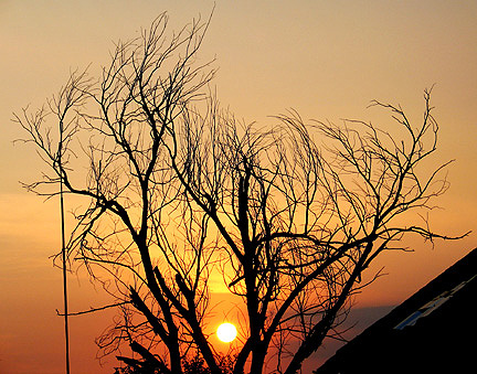
| I really like the tree here, everything is very well exposed. It would be really great to see the roof and pole the the left removed some how (either a big cloning job or waiting until the sunset occurs at a slightly different angle). However, I really like this one. |
|
 Photographer found comment helpful. Photographer found comment helpful. |
|
|
01/29/2007 05:08:33 PM |
| You have exposed the sun nicely here and created a good silhouette with the branches but for me this is a little too busy. Just isolating the branches and losing the building would work better in my opinion :o) |
|
| Photographer found comment helpful. |
Comments Made During the Challenge  |
|
|
09/13/2005 10:44:36 PM |
| nice concept nice ligting |
|
| Photographer found comment helpful. |
|
|
09/13/2005 12:57:43 PM |
| I keep getting pulled too the dark corner |
|
| Photographer found comment helpful. |
|
|
09/12/2005 07:23:14 PM |
| wish the flagpole? and house? were not in the pic -- very nice colors |
|
| Photographer found comment helpful. |
|
|
09/10/2005 08:16:47 PM |
|
| Photographer found comment helpful. |
|
|
09/10/2005 12:39:02 PM |
| I like the way you framed the sun with the branches and captured the colors. I don't like the antenna and roof....perhaps a closer crop? |
|
| Photographer found comment helpful. |
|
|
09/09/2005 07:34:34 PM |
| Very pretty but it would have looked nicer with less branches, but I guess you don't really want to cut a tree just for a photo. |
|
| Photographer found comment helpful. |
|
|
09/08/2005 10:31:15 PM |
| The color and upsweep of the branches make this an uplifting photo for me - I think of dawn. The image would be better without the pole and the large black object on the right. |
|
| Photographer found comment helpful. |
|
|
09/08/2005 08:14:18 PM |
| Would have probably been pretty. Too small though. |
|
| Photographer found comment helpful. |
|
|
09/08/2005 12:33:49 PM |
| A tighter crop would have worked wonders I think. the sun & tree siloulette is stunning, but the roof(?) and lampost/aerial add nothing to the photo. Good spotting though! |
|
| Photographer found comment helpful. |
|
|
09/08/2005 10:31:37 AM |
| The best image for me. The object black in right is not nice. 9. |
|
| Photographer found comment helpful. |
|
|
09/08/2005 12:29:50 AM |
| Great idea and super light. Personally I think it might have been even better without the inorganic items on either side. |
|
| Photographer found comment helpful. |
|
|
09/07/2005 10:15:19 PM |
| I like the trees and the sun, but unfortunately I find the building distracts from the overall impact. |
|
| Photographer found comment helpful. |
|
|
09/07/2005 04:59:48 PM |
| Nice sunset & sun placement, colors are amazing - 8 |
|
| Photographer found comment helpful. |
|
|
09/07/2005 04:49:26 PM |
| wonderful sun and branches. Did ya try cropping verticle to elimnate the roof and pole, might have even been better. |
|
| Photographer found comment helpful. |
|
|
09/07/2005 08:13:09 AM |
| IMO, maybe should have cropped out the line/pole on the left side, maybe even the house on the right? |
|
| Photographer found comment helpful. |
|
|
09/07/2005 05:35:51 AM |
| i think this is a great hpto , just wish you hadn't resized it so small... |
|
| Photographer found comment helpful. |
Home -
Challenges -
Community -
League -
Photos -
Cameras -
Lenses -
Learn -
Help -
Terms of Use -
Privacy -
Top ^
DPChallenge, and website content and design, Copyright © 2001-2025 Challenging Technologies, LLC.
All digital photo copyrights belong to the photographers and may not be used without permission.
Current Server Time: 03/11/2025 01:50:20 PM EDT.