| Author | Thread |
|
|
09/21/2005 05:22:11 PM |
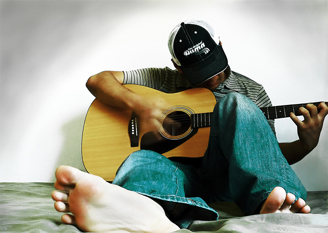
Hello, and greetings from the Critique Club. The critique you are about to recieve is tailored for DPC challenges alone, and is not intended to be seen as an artistic critique per se.
Initial Thoughts
Interesting, although not the strongest on the challenge theme in a DPC sense.
Composition / Content
As has been said, the foot sticking out here really does take a lot away from the main point of interest, and in a compositional sense, you really don't want anything leading your viewer off your subject. Content wise, it's a great pose and I love the motion blur on the hand, that's a wonderful little detail that many might have missed. Another point I'd have you consider is that the negative space is on the wrong side. Leading your negative space in the direction of the face and the strut of the guitar would have taken the focus off the foot, and put it more where you were trying to keep it, on the musician.
Background
The vignetting is just a little too obvious and cloudy. Not a smooth progression, and that probably got picked up on by a lot of voters as well.
Camera Work / Technical
A good choice of aperature and shutter speed, allowing some good exposure and that motion blur on the hand. Focus seems a *touch* soft.
Digital Processing
You didn't give any information about this, so I can't really comment. I do like your choice of color saturation though, gives it a nice gritty feel that works well.
Fits the Challenge
For DPC, this is a tentative fit to the challenge. It's a portrait, no question, but it's not what the majority of people were looking for, and as such, was probably hit for that. For my part, it's nice to see a few different takes, and this is a good attempt.
My Opinion of the Photo
A nice alternative portrait shot, some good color, and a nice pose, but a few issues that keep it from being really good. Good luck in future challenges. |
|
 Photographer found comment helpful. Photographer found comment helpful. |
Comments Made During the Challenge  |
|
|
09/18/2005 09:07:17 PM |
|
|
|
09/18/2005 12:26:35 PM |
| Ror reasons of both placement and brightness, I thnk the foreground foot is too dominant, though I like the idea and pose overall -- this could work with a tighter crop, maybe just to the left of the elbow and above the foot. |
|
|
|
09/17/2005 05:38:00 AM |
| I love the background in this. Would have liked the rest of the guitar to be in the shot but still a great photo. |
|
|
|
09/16/2005 04:46:50 PM |
| Interesting take on a portrait study. I honestly much prefer to see a little more of a person's face in a portrait. |
|
|
|
09/16/2005 11:38:37 AM |
| The sheet under the right foot is bothering me alot... Otherwise a cool shot! 7 |
|
|
|
09/15/2005 07:53:51 AM |
|
|
|
09/15/2005 01:50:09 AM |
| portrait are about someone's FACE. |
|
|
|
09/14/2005 10:06:58 PM |
| The color and framing is nice, however I would have liked to seen more focus on the man, and less of his foot. Besides that, well done. |
|
|
|
09/14/2005 01:42:14 PM |
| I like the composition and pose, but the edges look a bit too sharpened/processed to me. |
|
|
|
09/13/2005 10:53:51 PM |
| I like the angle the photo was taken from. Not crazy about the hand clur though. |
|
|
|
09/13/2005 03:16:34 PM |
|
|
|
09/13/2005 12:08:26 PM |
| I like this shot but it doesn't feel like a portrait to me. I think a portrait should include at least the identy of the subject. |
|
|
|
09/13/2005 11:53:39 AM |
| I like the action of his fingers. I think a portrait should include the face, so I would like to see his expression while he is strumming, and I really don't need to see the sole of his foot. I do like that you are showing something about who he is. |
|
|
|
09/13/2005 08:42:46 AM |
| Nice Picture! The front foot is a bit distracting though |
|
|
|
09/12/2005 10:46:18 PM |
|
|
|
09/12/2005 04:35:21 PM |
|
|
|
09/12/2005 03:07:31 PM |
| A foot portrait, that out-of-the box for sure. |
|
|
|
09/12/2005 08:42:39 AM |
| Cool shot.. wondering how this would have looked with slightly shallower DOF? |
|
|
|
09/12/2005 07:32:45 AM |
| I like this different approach. Nice capture! |
|
|
|
09/12/2005 02:02:54 AM |
| Very cool shot. Love the angle. |
|
|
|
09/12/2005 01:07:33 AM |
| very cool angle (hope his feet werent smelly), cool lighting,wish i could see the face though |
|
Home -
Challenges -
Community -
League -
Photos -
Cameras -
Lenses -
Learn -
Help -
Terms of Use -
Privacy -
Top ^
DPChallenge, and website content and design, Copyright © 2001-2025 Challenging Technologies, LLC.
All digital photo copyrights belong to the photographers and may not be used without permission.
Current Server Time: 03/12/2025 05:56:53 PM EDT.