| Author | Thread |
|
|
06/10/2003 03:16:01 PM |
*Critique Club*
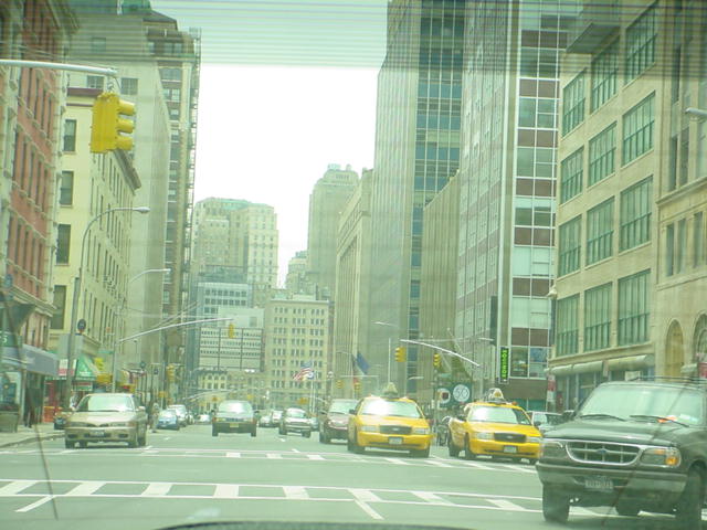
Actually, without your title, I would never have even known what country this was even in, except maybe for the hint of an american flag in the far distance. So the picture doesn't really talk to me, the title does though.
I see you're fairly new to DPC and I'll mention first, that snapshotty photos don't generally do well here. As you probably already found out. Don't let that scare you off though. Grow a thick alligator skin, and take comments into consideration, but don't take them too seriously.
That being said...Here's what I think.
Taken through the car window is a bad idea. It definately looks like a snapshot, and doesn't look like you spent any time at all trying to achieve this photo. Drove around the corner, snap, and continued on your way.
To me, the tilt of the buildings is not quite enough to represent a dramatic angle. It looks like a mistake. A result of trying to get a shot in a short period of time with lots of things in your way.
The colors are really muted, and this is probably a result of the lighting conditions and being shot through glass.
Your sky is really blown out. Way too white. and while this may draw attention to this area of the photo, I think it over does it. See how the whiteness is engulfing the tops of the buildings in the background? Kind of washing away the detail in the buildings around the white area.
The focus in my opinion should be toward the back as well, if this is where you are trying to draw our attention. It's hard to tell, but the sharpest focus to me, looks like the white lines on the road in the bottom left hand corner of the photo. Not the most interesting thing in the pic to have been in sharpest focus.
i think that had you taken 15 minutes to find a place to park, and walk here to take this shot, it would have made a whole lot of difference. it takes time and patience to get great photos. However, It does happen that once in awhile you have an accident and it's the prettiest accident you've ever had with your camera. lol
Keep at it!
~Heather~ |
|
Comments Made During the Challenge  |
|
|
06/03/2003 11:53:30 PM |
| from inside a car? The reflections are distracting... |
|
|
|
06/03/2003 03:29:37 PM |
| Understand the concept, but doesn't work for me, at least take a clear picture instead of a snaphsot through the glass. |
|
|
|
06/01/2003 10:24:16 PM |
| Humm, sad for ever. Fun creative shot out the back window. |
|
|
|
05/31/2003 11:27:41 AM |
| yes, this is very sad... i like the mood created by taking this picture thru the glass... 8 |
|
|
|
05/29/2003 10:28:55 PM |
|
|
|
05/29/2003 04:10:44 PM |
5. Fits the theme well enough, and there are no blatant 'you suck!' flaws to it, but neither does it really grab me for any reason at all. For reasons of composition, cropping, or subject choice, it's just a photo, and doesn't do especially much for me, aesthetically.
It looks like I'm viewing it through a sheet of seafoam-green cellophane (or the back window of a car, which seems more likely in a logical sense). The faint lines across it from the rear defroster likewise distance from the subject, and in the field of view there's nothing actually in focus or compositionally central to draw the attention. A closer crop on the cab(s) might have been a more interesting shot, perhaps cropped so it's a vertical frame, echoing the lines of the buildings behind them? |
|
|
|
05/29/2003 01:19:33 PM |
| A bit more contrast would have helped. |
|
|
|
05/29/2003 04:06:51 AM |
| There are filters you can but that may reduce the amount of reflection from the window. For a digital auto focus camera you need a circular polarizer. They are also usefull for taking shots over water, when you need to resuce glare. |
|
|
|
05/28/2003 11:03:46 PM |
| To emphasize the vacant area in the sky I would have spot metered on the sky so it wasn't so washed out. I would also show more of the sky. It probably would have been better if you were in a crosswalk taking the picture rather than your car. Though I'm sure the drivers behind you wouldn't have appreciated you getting out to take a picture. I like the slight tilt. It adds impact. The focus is a little soft. I think the focus should have been on the buildings at the very back of the picture. This, along with more sky and better exposure would draw the viewer in to your picture. |
|
|
|
05/28/2003 09:03:04 PM |
| This is where the twin towers were I take it. The picture is a little overexposed, and the lines from the glass of the car are a little distracting. |
|
|
|
05/28/2003 01:02:59 PM |
| I'm afraid a shot out a car window is pretty much always a bad idea... there's just too much awkward reflection and color distortion. |
|
|
|
05/28/2003 08:33:15 AM |
| This would have been better taken outside the car. 5 |
|
|
|
05/28/2003 01:55:44 AM |
| Did you take this picture from inside a car? That glare is very detracting to the photo. Maybe you could have cropped it out. Overall not a bad pic though. |
|
Home -
Challenges -
Community -
League -
Photos -
Cameras -
Lenses -
Learn -
Help -
Terms of Use -
Privacy -
Top ^
DPChallenge, and website content and design, Copyright © 2001-2025 Challenging Technologies, LLC.
All digital photo copyrights belong to the photographers and may not be used without permission.
Current Server Time: 03/12/2025 01:57:43 PM EDT.