| Author | Thread |
Comments Made During the Challenge  |
|
|
09/18/2005 11:45:34 PM |
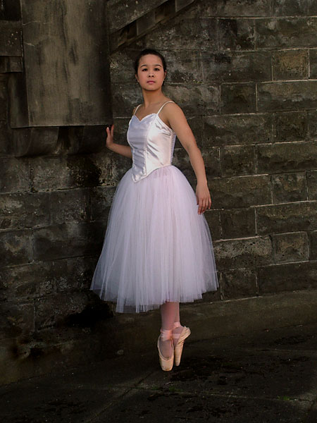
| Lovely contrast of attire and the the rustic stones. 7 |
|
 Photographer found comment helpful. Photographer found comment helpful. |
|
|
09/18/2005 11:25:57 PM |
|
| Photographer found comment helpful. |
|
|
09/16/2005 04:39:53 PM |
| Too much stone wall, not enough ballerina for me. Would have liked to have seen a tighter crop. Lighting looks good though! |
|
| Photographer found comment helpful. |
|
|
09/15/2005 10:10:42 PM |
| I wonder how this would look if it were cropped in a bit more from the right hand side? This would take the subject out of the center, which for me, makes photos a bit more interesting. I do like how she has a pretty white tutu against the dirty, gritty background. |
|
| Photographer found comment helpful. |
|
|
09/15/2005 05:19:51 AM |
| The subject is too central. There is too much space around her and I'm not getting a good look at her. I like the idea of a somewhat out of place ballerina. A tighter crop and slightly different composition with hernot in the center would have amde for a very nice image. 5 |
|
| Photographer found comment helpful. |
|
|
09/14/2005 01:55:51 PM |
| nice picture, but needs more light brought into the subjects face. i think this shot might be downgraded for not cropping tightly around her face, which isn't necessarily a requirement, but i think for this to be considered a portrait, you need to really highlight the model's face. currently, i think her eyes are too dark and just sink into her face, removing any expression that could have been interpreted. a shame, because the background is lovely, and the model has a lot of potential. I'd try to reshoot this with a light reflector to get some more natural lighting. 5/10 |
|
| Photographer found comment helpful. |
|
|
09/13/2005 11:26:20 PM |
| I love the pose. I wish it were a little closer to the subject to reveal more of her face. I also am unsure about the background, it seems so noncongruous with a ballerina. I like it and I don't like it...7 |
|
| Photographer found comment helpful. |
|
|
09/13/2005 10:58:21 PM |
| Elegant shot, the looks seems so focused. |
|
|
|
09/13/2005 08:23:04 PM |
| lovely image, especially the dlicate look of your lovely model against the opposite looking background. great idea |
|
| Photographer found comment helpful. |
|
|
09/13/2005 04:22:59 PM |
|
| Photographer found comment helpful. |
|
|
09/13/2005 04:27:24 AM |
| beautiful location. your model's casual elegance and strength are quite attractive. |
|
| Photographer found comment helpful. |
|
|
09/12/2005 10:09:52 PM |
| This is an interesting image though it looks like the wall might be in better focus than her face. |
|
| Photographer found comment helpful. |
|
|
09/12/2005 08:03:26 PM |
| nice...wish the girl could have been a little closer |
|
| Photographer found comment helpful. |
|
|
09/12/2005 07:10:14 PM |
| I like the way her lovely dress contrasts with the background. Great portrait. |
|
| Photographer found comment helpful. |
|
|
09/12/2005 02:45:37 PM |
| What a beautiful photo. I love the way her delicate, feminine beauty contrasts with the old, dingy brick wall. Really a great job. |
|
| Photographer found comment helpful. |
|
|
09/12/2005 12:04:26 PM |
| I like the full body portrait...nice job. |
|
| Photographer found comment helpful. |
|
|
09/12/2005 11:14:31 AM |
| your background is not straight and is very distracting from your beautiful ballerina. |
|
| Photographer found comment helpful. |
|
|
09/12/2005 09:43:23 AM |
| Nice contrast of the gracefulness of the dancer with the harsh "industrial" appearance of the background. A little different of a crop would've pleased me more but nicely done shot. |
|
| Photographer found comment helpful. |
|
|
09/12/2005 09:10:00 AM |
| I like the softness of her en pointe with the tutu against the craggy concrete floor and stone wall. I wish she were larger in the shot so I could concentrate on her pretty face. This is more of an entire body shot than what I think of as a true portrait. Still, it is very well shot and you did a good job. 7 |
|
| Photographer found comment helpful. |
|
|
09/12/2005 02:27:05 AM |
| Beautiful. She's kind of far away though...perhaps could crop a little more on the right and bottom. |
|
| Photographer found comment helpful. |
|
|
09/12/2005 12:29:47 AM |
| very nice...ballerinas rock! |
|
| Photographer found comment helpful. |
|
|
09/12/2005 12:24:11 AM |
| I like this just for the reason that she looks out of place in that setting. That makes it interesting. Good pic. |
|
| Photographer found comment helpful. |
Home -
Challenges -
Community -
League -
Photos -
Cameras -
Lenses -
Learn -
Help -
Terms of Use -
Privacy -
Top ^
DPChallenge, and website content and design, Copyright © 2001-2025 Challenging Technologies, LLC.
All digital photo copyrights belong to the photographers and may not be used without permission.
Current Server Time: 03/14/2025 06:04:21 AM EDT.