*Critique Club*
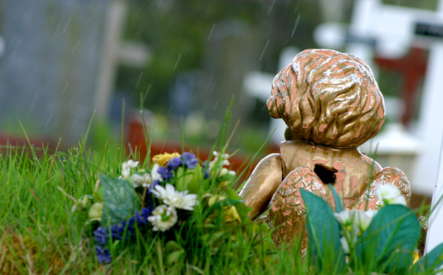
Had not been for the title and description, I don't think I would have even figured out that this was a cemetery.
The background is nicely blurred, but I think that works against you here, as it's hard to grasp the surroundings without being pointed in the direction of this being a cemetery. You know. Once something's been pointed out, it's obvious, but until then, you're like "what the??".
I also don't think I'm too fond of the angle. Why did you decide to take a photo of the back of the angel? Especially as it looks like he's been shot in the back. I think the large hole in his back is not pleasant.
The rain is a nice touch. I think that had this been executed differently, the rain would have added a lot to the shot.
The flowers are dead center of the photo, yet they are reallyout of focus. I find this distracting. Especially with the patch of grass to the left that is in nice sharp focus. I realize that you were trying to focus in on the angel and make that the sharpest focus, however, with the patch of non focused flowers right in the middle, it doesn't work out as nicely.
Lighting seems to have been good. No horrible hot spots, or distracting shadows.
Also, the background seems to be leaning to the right, and even though the angel is upright just fine, seems a bit odd for everything to be leaning this way.
As for meeting the challenge, that's up to you. Everyone sees things differently, and if this is what you think of when you see home, then so be it. Who am I to say differently.
~Heather~ |