| Author | Thread |
|
|
09/24/2005 10:13:55 PM |
*Critique Club*
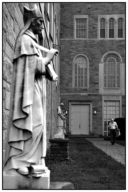
Wow the title was a great choice and so catching. I do like the image and I can defiantly see what frustrations you would have had with that statue being out of focus but I can understand the key was capturing the man. Overall this is a great shot. I think it would be more appealing to the masses if the statue was in focus, but you still captured an interesting perspective of the world. I am really glad you used the black and white, it makes the photo look nice and classic. After reading a couple of your comments, I would have to agree with you and say including the man in the photo was a great choice. Also I really like the contrast and how the gentleman's t-shirt and that small light pop out of the image. One last thing I liked is that you chose to capture all the way to the top of the statues hat, I think if you had cropped it out the shot would be missing something. Good job! |
|
 Photographer found comment helpful. Photographer found comment helpful. |
Comments Made During the Challenge  |
|
|
09/18/2005 01:42:42 AM |
| I would have like the first saint a little more in focus too. But good otherwise! |
|
| Photographer found comment helpful. |
|
|
09/16/2005 08:00:50 PM |
| Nice clean image with lots of good perspective. Good Job! |
|
| Photographer found comment helpful. |
|
|
09/15/2005 10:58:55 AM |
Interesting - and I like the title. I like that the man is focused and the saints are not
I recognize St. Frances of Assisi - who's the other one? Nice linear quality to it with the architecture. Perfect use of black and white. |
|
| Photographer found comment helpful. |
|
|
09/14/2005 10:53:37 PM |
| would be better if you cropped it to just the left half perhaps |
|
|
|
09/14/2005 08:48:29 PM |
| Nice perspective, and interesting picture. Composition is good too. Nice job. |
|
| Photographer found comment helpful. |
|
|
09/14/2005 08:38:55 PM |
| The little old man in the background is creating tension and not helping our picture very much. Maybe next time crop out the things that interfere with your main idea. |
|
|
|
09/14/2005 01:29:01 AM |
| I think the image in the foreground should be sharper. |
|
| Photographer found comment helpful. |
Home -
Challenges -
Community -
League -
Photos -
Cameras -
Lenses -
Learn -
Help -
Terms of Use -
Privacy -
Top ^
DPChallenge, and website content and design, Copyright © 2001-2025 Challenging Technologies, LLC.
All digital photo copyrights belong to the photographers and may not be used without permission.
Current Server Time: 03/12/2025 09:01:29 AM EDT.