| Author | Thread |
|
|
07/05/2003 12:21:17 AM |
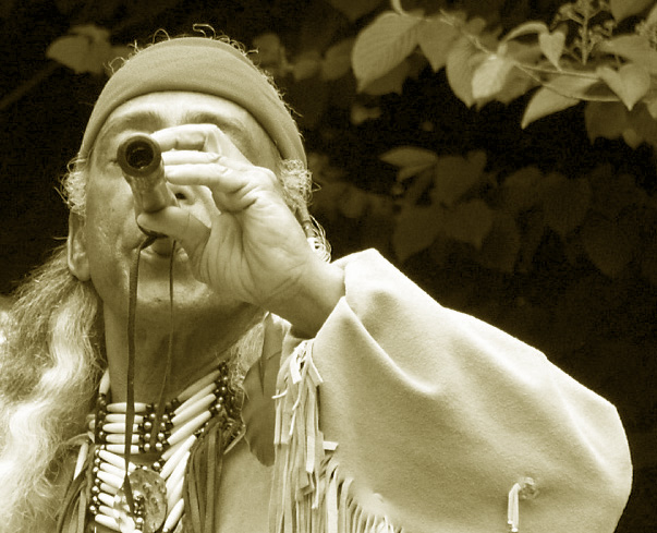
| nice image, the toning is really unique! |
|
Comments Made During the Challenge  |
|
|
06/08/2003 10:35:52 PM |
| Lovely shot. Composition is wonderful. The choice of blocking his face is probably appropriate, but I'd sure like to see it! |
|
|
|
06/07/2003 11:49:36 PM |
| Very nice image. Interesting tones and lines, and really conveys the challenge well. 8 |
|
|
|
06/06/2003 06:42:03 PM |
| great idea, but I wish you were over to one side so we could see his eyes or more of his face to give him an identity and see more of what he is doing. :) Nice use of doutone. |
|
|
|
06/04/2003 04:05:13 PM |
| Better if his face wasn't covered I think...good shot all the same though |
|
|
|
06/04/2003 06:56:54 AM |
| Good - would look better if we are able to see the eyes... |
|
|
|
06/03/2003 12:16:05 AM |
| The pic has a strong green tint to it. :( Did you mean for it to look like that? If not, may want to adjust your monitor. |
|
|
|
06/02/2003 07:52:49 PM |
| Wow, what an amazingly neat subject for a photo. It does meet the challenge, in an unusual and strikign way. I'm trying to decide if I think the man should be a little further to the right so there's no negative space on the right edge of the elbow; I think that might have been a little nicer. Top to bottom is fine, though. |
|
|
|
06/02/2003 06:01:49 PM |
| Wish we could see more of his face, or it was less in focus. Nice composition. 8 |
|
|
|
06/02/2003 03:20:48 PM |
| The composition, coloring, and lighting are all perfect. 10. |
|
|
|
06/02/2003 01:09:41 PM |
| I'm not too keen on the yellowy greeny duotone colour, i think a black and white would look more appealing, maybe with a little added contrast |
|
|
|
06/02/2003 11:59:07 AM |
| photo is nice but the fact we can't see the eyes of the man is disturbing, IMHO. The rest of the shot is superb. |
|
|
|
06/02/2003 09:51:15 AM |
| ....would of liked to see his face. |
|
|
|
06/02/2003 02:41:19 AM |
| very nice. i like the duotone a lot. would like to see his face with him blowing more downward, although the uplifting gives it more emotion. |
|
|
|
06/02/2003 01:06:12 AM |
| I really like the lighting and of this photo. It is crisp and clean. The duotone is fitting. I feel it meets challenge. I only wish I could see more of the face of the performer. 8 Good luck in the challenge. |
|
Home -
Challenges -
Community -
League -
Photos -
Cameras -
Lenses -
Learn -
Help -
Terms of Use -
Privacy -
Top ^
DPChallenge, and website content and design, Copyright © 2001-2025 Challenging Technologies, LLC.
All digital photo copyrights belong to the photographers and may not be used without permission.
Current Server Time: 03/13/2025 02:07:58 AM EDT.