| Author | Thread |
|
|
09/27/2005 03:13:16 PM |
*Critique Club*
Sorry for the delayed critique, I had drawn a couple photos from the list and somehow didn't get to critique them, and just now noticed they weren't done, so here goes...
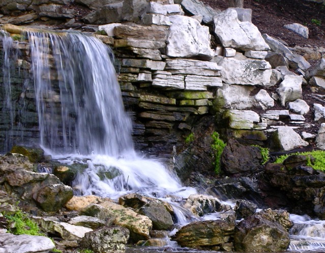
First off, I think I'm in agreement with the other commenters. The photo hurts my eyes. Really pretty scene, nothing 'jume out of my seat exciting', however, looks relaxing and definately not a place I'd see every day. I think it's the softness that hurts the photo in my opinion. It's not just the water, it seems that the rocks to the right are soft too, and also the rocks to the bottom, so really it's the whole photo. Was this a hand held long exposure? Maybe a little movement that blurred it?
One comment states that a tighter crop would work, and one states that the crop may be too tight chopping off part of the waterfall. Hmmm... I'm going to have to go with tighter crop. I think that by cropping off the tiny section to the left would eliminate any feeling that there was something else to the left. Also, by eliminating the rocks at the bottom of the photo, it brings our view up to the bottom of the waterfall, which is certainly more exciting than the dark rocks at the bottom of the photo.
While I think the green is a very pretty shade. Nice and vibrant, I think that there just isn't enough of it to really help the photo. In otherwords, it creates a random distraction rather than adding to the visual appeal of the photo. Does that make sense?
Lighting appears to be ok, although the mixture of dark objects to light objects just doesn't seem to flow. The photo isn't balanced right. Not really sure what you could do to fix that in a natural setting such as this, (natural in the sense that you can't change it) but it is an observation.
Overall I get the feeling of the location, but I'm not drawn in. ~Heather~
Message edited by author 2005-11-14 01:19:39. |
|
 Photographer found comment helpful. Photographer found comment helpful. |
Comments Made During the Challenge  |
|
|
09/22/2005 07:56:08 PM |
| Very nice shot. The upper right is a bit distracting. A tighter crop would have helped. |
|
| Photographer found comment helpful. |
|
|
09/21/2005 10:41:40 PM |
| With just a bit more crispness or increased saturation to make it "pop," I would have scored this higher. What a very pretty place though, and I like the composition. |
|
| Photographer found comment helpful. |
|
|
09/20/2005 05:25:00 PM |
Nope, doesn't work for me. I just don't like the bricks or the stone to the right of the waterfall. At least you should have darkened them a bit.
But it's the composition I find most lacking here. It's just not interesting enough. It seems, for example, that you didn't include the entire waterfall in the image (the leftmost part is missing) and a foreground is sorely lacking here. Perhaps if you had gone slightly more to the right and positioned the camera a bit lower, using the stone in the bottom right corner as some kind of foreground. A vertical composition might also have worked better here, perhaps following the small stream to the waterfall? |
|
| Photographer found comment helpful. |
|
|
09/20/2005 09:25:34 AM |
| The location is beautiful but the image is just enough out of focus (or blurred) to make it uncomfortable to look at. The white rocks are brighter than the water, drawing my eye and demanding my attention. This detracts from the image. Like the blur in the water. 5 |
|
| Photographer found comment helpful. |
|
|
09/19/2005 09:07:05 PM |
| hm, I suppose you meant "sea level." the endless flow of gravity downhill. good take on the challenge. |
|
| Photographer found comment helpful. |
|
|
09/19/2005 07:22:38 PM |
| Did you mean the water's final destination? This is a great photo! |
|
| Photographer found comment helpful. |
|
|
09/19/2005 06:43:27 PM |
| focus just doesn't seem clear to me and it's not just the softness. Nice view |
|
| Photographer found comment helpful. |
|
|
09/19/2005 06:38:22 PM |
| Is this your destination? "Give us a sense of where you dream of going, or where you're fated to go." |
|
| Photographer found comment helpful. |
Home -
Challenges -
Community -
League -
Photos -
Cameras -
Lenses -
Learn -
Help -
Terms of Use -
Privacy -
Top ^
DPChallenge, and website content and design, Copyright © 2001-2025 Challenging Technologies, LLC.
All digital photo copyrights belong to the photographers and may not be used without permission.
Current Server Time: 03/17/2025 03:53:57 AM EDT.