| Author | Thread |
|
|
10/05/2005 07:54:56 PM |
*Critique Club*
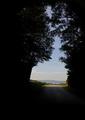
Let me just start out by saying that I thought this photo was fantastic!
The green grass and the blue sky with the clouds is just beautiful. I think what hurt your entry is the size of it. It is way too small. Small pictures are hard to see and to judge. Because of the small size we are not able to see the details and quality of the picture.
I love the guy in the background! He looks so thrilled. You named the picture well, this would make a great card. I am so sure that if you would have entered a larger version of this picture your score would have been a lot higher. Keep that in mind for your next entry.
Mandy |
|
Comments Made During the Challenge  |
|
|
10/01/2005 06:52:54 PM |
| Love the perspective! Wish it wasn't so small on my monitor so I could get a really good look at it. Its a great shot! |
|
|
|
10/01/2005 02:01:39 PM |
| Nice composition, color, and exposure. The image is tiny |
|
|
|
09/30/2005 04:34:09 PM |
| Great concept, too bad about the sizing. |
|
|
|
09/30/2005 10:37:13 AM |
| The image is way too small! It's impossible to see any details, but from what I can see, the focus seems a little soft. |
|
|
|
09/29/2005 09:16:31 PM |
| A couple things that would really improve this. 1. Make it larger you can submit photos up to 640 pixels on one side. 2. If the flag pole were somehow straight up and down that would make it a stronger shot. |
|
|
|
09/28/2005 11:03:59 PM |
would be nice posted larger... too bad
|
|
|
|
09/28/2005 09:01:11 PM |
| I have seen alot of golf pictures on this website. This is one of the more interesting and creative ones. Good job. |
|
|
|
09/28/2005 07:57:59 PM |
| Neat image. Too small however. |
|
|
|
09/27/2005 06:23:46 PM |
| The picture is very small. |
|
|
|
09/27/2005 10:15:56 AM |
| the green looks a little yellow, pull that out with selective color or hue/sat and you've got a much stronger photo. The tree cut off on the right side is distracting too. nice work! 7 |
|
|
|
09/26/2005 11:03:04 PM |
| good concept and composition from what i can tell... next time i'd suggest submitting a larger image. |
|
|
|
09/26/2005 10:33:06 PM |
| I think this would have been a lot better with a larger size. |
|
|
|
09/26/2005 04:14:01 PM |
| I like the concept. Unfortunately, the small size of the entry makes it very difficult to see what is going on. |
|
|
|
09/26/2005 12:48:42 PM |
| A bit too small to see any of the detail |
|
|
|
09/26/2005 11:56:41 AM |
| way too small, looks like it would have been a great photo though. |
|
|
|
09/26/2005 11:15:47 AM |
| try making yrouphoto a bit bigger... 640 px by 480 px is a good size, which enables all to see what is in the photo... this is an excellently done photo and i can see it beingused in a card very well 8 |
|
|
|
09/26/2005 09:34:14 AM |
| great pic, and a great card ...but make it bigger go for the 640 size it will add a lot more impact. |
|
|
|
09/26/2005 07:21:09 AM |
| Pity the picture is so small. A lot of the detail is lost. Shouldn't he be celebrating when the ball is in the hole? |
|
|
|
09/26/2005 06:42:27 AM |
|
|
|
09/26/2005 04:18:39 AM |
|
Home -
Challenges -
Community -
League -
Photos -
Cameras -
Lenses -
Learn -
Help -
Terms of Use -
Privacy -
Top ^
DPChallenge, and website content and design, Copyright © 2001-2025 Challenging Technologies, LLC.
All digital photo copyrights belong to the photographers and may not be used without permission.
Current Server Time: 04/29/2025 12:11:50 PM EDT.