| Author | Thread |
|
|
06/12/2003 03:30:22 PM |
Originally posted by hbunch7187:
*Critique Club*
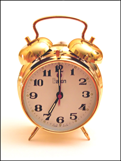
I almost didn't notice the motion blurr, but I was trying to figure out where the sharpest focus was, and couldn't find it, but then found the motion blurr.
I wish that more of the clock were in focus, and that the motion blurr stood out a bit more. As is, it's not really obvious enough to stand out at us as the main part of the photo. Also, the numbers on the clock being a bit oof bother me a bit.
The angle and framing/cropping are good. I like how you centered the clock, but also like how you took the shot from a little bit of a 'from above' angle. This gives it a bit of visual appeal.
I'm not really sure about the reflections in the clock. The one on the right bell looks like a reflection of the photographer, and it looks like the photographer is holding the camera, or at least touching it. If this is true, had you set the camera down on something to avoid any camera shake, the actual clock could have turned out a bit sharper.
I think that this fits nicely into the Sound challenge and portrays it very well.
~Heather~ |
Thanks Heather,
Now I see why crabappl3's came 5th and mine came 44th. :) |
|
|
|
06/12/2003 01:44:08 PM |
*Critique Club*
I almost didn't notice the motion blurr, but I was trying to figure out where the sharpest focus was, and couldn't find it, but then found the motion blurr.
I wish that more of the clock were in focus, and that the motion blurr stood out a bit more. As is, it's not really obvious enough to stand out at us as the main part of the photo. Also, the numbers on the clock being a bit oof bother me a bit.
The angle and framing/cropping are good. I like how you centered the clock, but also like how you took the shot from a little bit of a 'from above' angle. This gives it a bit of visual appeal.
I'm not really sure about the reflections in the clock. The one on the right bell looks like a reflection of the photographer, and it looks like the photographer is holding the camera, or at least touching it. If this is true, had you set the camera down on something to avoid any camera shake, the actual clock could have turned out a bit sharper.
I think that this fits nicely into the Sound challenge and portrays it very well.
~Heather~ |
|
 Photographer found comment helpful. Photographer found comment helpful. |
Comments Made During the Challenge  |
|
|
06/08/2003 10:56:34 PM |
| Nice shot! The ring is fairly apparent, but perhaps a bit closer to the bells would help us see this motion blur better. |
|
| Photographer found comment helpful. |
|
|
06/08/2003 10:06:54 PM |
| i would have liked the focus/attention to have been more on the bell portion, its hard to see the motion blur at first with this composition. |
|
| Photographer found comment helpful. |
|
|
06/03/2003 12:26:18 AM |
| It's a pity someone did almost this same shot. I opined there that a different background or a brass tone to the clock would have made the ringing more obvious, but you have a similar problem -- darker background for this one might have made it stand out more. Anyhow, it IS on topic, and it's a nice shot, very clean, but the clapper is a little TOO blurry -- maybe a slightly shorter exposure time? |
|
| Photographer found comment helpful. |
|
|
06/03/2003 12:11:30 AM |
| Awesome shot of the clock! Too bad you couldn't bring out the motion of the "hammer" hitting the bells more, but very good anyway! |
|
| Photographer found comment helpful. |
|
|
06/02/2003 10:25:29 PM |
| I'm not sure whether or not I like the fact that I can see your reflection at the top of the alarm clock, but I like the shadow and the whole tone of the photo. |
|
| Photographer found comment helpful. |
|
|
06/02/2003 03:42:08 PM |
| The lighting is perfect. It takes a second here though to see that the clock is ringing right now. Perhaps a macro of just the bells and the clapper? Anyway, 7. |
|
| Photographer found comment helpful. |
|
|
06/02/2003 04:15:03 AM |
|
| Photographer found comment helpful. |