| Author | Thread |
Comments Made During the Challenge  |
|
|
10/04/2005 08:55:07 PM |
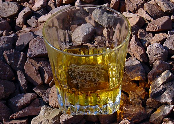
| Cute idea, good title, the image maybe lets it down a little. This would probably be better done in your "studio" where you could control the light and the drama |
|
|
|
10/01/2005 06:18:48 PM |
| emblem on glass is distracting. "Scotch on the rocks." Is that a saying or something? Maybe I'm too young to understand, but it seems pretty pointess to me. |
|
|
|
10/01/2005 06:17:09 PM |
| Nice picture, very creative thinking. |
|
|
|
09/30/2005 01:27:50 AM |
|
|
|
09/29/2005 06:43:19 AM |
a nice pun
but not a very appealing photo.
a lower angle perhaps would have been better.
or a wider view using the rule of thirds could have added more punch. |
|
|
|
09/28/2005 11:45:11 PM |
| image is sharp from top to bottom |
|
|
|
09/28/2005 09:29:16 PM |
|
|
|
09/28/2005 01:39:55 PM |
| different color rocks would have been better. THey are camoflauged in with the drink. |
|
|
|
09/28/2005 12:55:59 PM |
| Cool idea. Technically, this is a decent shot wrt focus and lighting. I think the composition might have been stronger if it wasn't so centred. JMO. |
|
|
|
09/28/2005 08:51:14 AM |
| Shot Would Have Been Nicer Had You Placed The Rocks INSIDE The Glass... |
|
|
|
09/28/2005 05:58:10 AM |
| Chippings actually. But I like the idea - this way "rocks" are not killing aroma of a nobel beverage. Would turn glass a bit to not having a sign artificially centered. |
|
Home -
Challenges -
Community -
League -
Photos -
Cameras -
Lenses -
Learn -
Help -
Terms of Use -
Privacy -
Top ^
DPChallenge, and website content and design, Copyright © 2001-2025 Challenging Technologies, LLC.
All digital photo copyrights belong to the photographers and may not be used without permission.
Current Server Time: 03/12/2025 02:37:07 PM EDT.