| Author | Thread |
Comments Made During the Challenge  |
|
|
10/10/2005 07:56:30 AM |
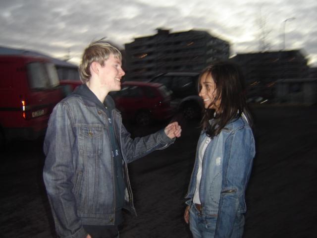
Too subtle... the complementary colours of orange (fleshtones) and blue (denim) are so unsaturated that the whole picture comes off as a study in neutral tones.
|
|
|
|
10/09/2005 10:24:38 PM |
|
These two look like they're happy to see each other. However, don't really see how it fits the challenge... |
|
|
|
10/09/2005 04:04:24 AM |
|
|
|
10/08/2005 07:49:08 PM |
|
Looks like you were trying for motion blur, but I don't like the way it came out -- it just looks like you couldn't hold the camera still. Aside from that I can't see what this has to do with the challenge. |
|
|
|
10/07/2005 04:52:36 PM |
|
no comp colors do I see, blurred image, halo on man |
|
|
|
10/07/2005 12:43:56 PM |
|
I really like this pic, but it doesn't meet the challenge. |
|
|
|
10/06/2005 09:32:39 AM |
|
This photo does not belong to the challenge. Emotionaly interesting. |
|
|
|
10/05/2005 09:28:08 PM |
|
I see no resemblance of complementary colors here. The shot has technical merrit, but the subjects don't look natural enough. |
|
|
|
10/05/2005 04:16:23 PM |
|
There are no complementarty colors. |
|
|
|
10/05/2005 09:31:15 AM |
|
Interesting picture. Like the blurred background. Really makes them stand out. Don't see much on the complementary color though. |
|
|
|
10/05/2005 09:29:58 AM |
|
Blurry, does not meet the challenge. |
|
Home -
Challenges -
Community -
League -
Photos -
Cameras -
Lenses -
Learn -
Help -
Terms of Use -
Privacy -
Top ^
DPChallenge, and website content and design, Copyright © 2001-2026 Challenging Technologies, LLC.
All digital photo copyrights belong to the photographers and may not be used without permission.
Current Server Time: 07/20/2026 08:43:27 AM EDT.