| Author | Thread |
Comments Made During the Challenge  |
|
|
10/11/2005 10:45:39 PM |
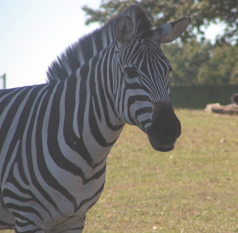
| good composition. overly bright sky is distracting. focus is a bit off. |
|
 Photographer found comment helpful. Photographer found comment helpful. |
|
|
10/11/2005 11:11:57 AM |
| try using curves next time for more contrast :) |
|
| Photographer found comment helpful. |
|
|
10/10/2005 07:17:17 PM |
| Washed out or overexposed... Composition and idea is good though. |
|
| Photographer found comment helpful. |
|
|
10/10/2005 03:21:50 PM |
| i am sure the black and white has brought you greef .......although the zebra does apear in focuse there seems also to be a lack of saturation apeares dull and lifless |
|
| Photographer found comment helpful. |
|
|
10/10/2005 07:34:10 AM |
Complementary colours are pairs of colours that contrast strongly when compared to each other. The main colour effect here is from the green of the grass in the background.
Black and white are neutrals and not colours at all, and therefore they cannot be complementary colours... white shows the presence of light, and black shows the absence of light. Black and white areas next to each other do demonstrate high contrast, but high contrast gives a different visual effect than complementary colours do in a picture.
Check some of the forum discussions on complementary colours for suggestions on using colour for contrast.
|
|
| Photographer found comment helpful. |
|
|
10/08/2005 04:56:14 AM |
| Photo looks a little washed out. Try increasing contrast. Might help take care of it.Looks like light hitting the lens to me. You've probably heard this about a hundred time by now but complementary colors. |
|
| Photographer found comment helpful. |
|
|
10/07/2005 09:50:01 PM |
| Nice photo--I would have used a soft flash, but don't think it meets the challenge. |
|
| Photographer found comment helpful. |
|
|
10/07/2005 07:01:23 PM |
| I truely applaud you choice of B&W for this challenge |
|
| Photographer found comment helpful. |
|
|
10/07/2005 03:58:04 PM |
| sorry the photo seems so foggy...too much brightness/contrast perhaps in editing? It really distracts from the subject. |
|
| Photographer found comment helpful. |
|
|
10/07/2005 06:27:28 AM |
| This shot is very overexposed which spoils it |
|
| Photographer found comment helpful. |
|
|
10/06/2005 11:32:02 PM |
Unfortunately, black and white are not colors so they can't be complementary. As for the zebra, it's very flat looking. I think it would have benefitted greatly by a boost in contrast.
Message edited by author 2005-10-12 03:06:06. |
|
| Photographer found comment helpful. |
|
|
10/06/2005 09:44:41 PM |
| Not sharp enough for my taste |
|
| Photographer found comment helpful. |
|
|
10/06/2005 09:14:25 PM |
| kinda flat, contrast needed |
|
| Photographer found comment helpful. |
|
|
10/06/2005 06:29:12 PM |
| B&W are not complementary colors unfortunately. Needs contrast as well. |
|
| Photographer found comment helpful. |
|
|
10/06/2005 03:44:48 PM |
| The result of shooting into the sun, too bad the positions weren't reversed. Too little contrast. |
|
| Photographer found comment helpful. |
|
|
10/06/2005 10:03:25 AM |
| Nice but seems a bit foggy. |
|
| Photographer found comment helpful. |
|
|
10/06/2005 08:55:16 AM |
| interesting picture. Love the stripes on him. |
|
| Photographer found comment helpful. |
|
|
10/05/2005 12:17:26 PM |
| ...are not complement colors. More intesive lighting of zebra (even fill-in flash) would add some vitality to the photo. |
|
| Photographer found comment helpful. |
|
|
10/05/2005 11:49:31 AM |
| This does not meet the challenge--black and white are not colors. I don't know what it is called, but I do not like the "foggy" effect. |
|
| Photographer found comment helpful. |
|
|
10/05/2005 10:17:28 AM |
| great composition and focus a bit of levels and contrast wouldve made this photo not so hazy looking. and selective color(white) wouldve made your whites real white and the black selective color wouldve ade the blacks true...good luck, hope this helps :o) Cher |
|
| Photographer found comment helpful. |
|
|
10/05/2005 10:07:52 AM |
| there's a white haze over the photo and it looks washed ou tin general |
|
| Photographer found comment helpful. |
|
|
10/05/2005 09:27:44 AM |
| I think that this might be a little overexposed for my taste. I think I'd prefer more contrast between the black & white (but even then I'm afraid it wouldn't fit the challenge for me). |
|
| Photographer found comment helpful. |
|
|
10/05/2005 09:09:46 AM |
| Does not meet the challenge, photo is washed out, very dull. |
|
| Photographer found comment helpful. |
|
|
10/05/2005 07:13:52 AM |
| black & white are neutrals, not colors |
|
| Photographer found comment helpful. |
Home -
Challenges -
Community -
League -
Photos -
Cameras -
Lenses -
Learn -
Help -
Terms of Use -
Privacy -
Top ^
DPChallenge, and website content and design, Copyright © 2001-2025 Challenging Technologies, LLC.
All digital photo copyrights belong to the photographers and may not be used without permission.
Current Server Time: 03/14/2025 06:27:17 AM EDT.