| Author | Thread |
|
|
10/12/2005 02:36:24 PM |
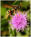
you have many sets of complementary colors which makes this a unique winner. red/green, purple/yellow, etc. thanks.
Message edited by author 2005-10-12 14:36:39. |
|
 Photographer found comment helpful. Photographer found comment helpful. |
|
|
10/12/2005 02:32:12 PM |
| Wow, thought for sure this would be top 10. It's technically a wonderful picture. |
|
| Photographer found comment helpful. |
|
|
10/12/2005 12:38:54 AM |
| this really should've placed higher... i love this... going to my faves! |
|
| Photographer found comment helpful. |
Comments Made During the Challenge  |
|
|
10/11/2005 08:55:51 PM |
| Seems more like primary colors than complemenary. I like the image on it's own merit though |
|
| Photographer found comment helpful. |
|
|
10/11/2005 12:26:33 PM |
|
| Photographer found comment helpful. |
|
|
10/11/2005 11:07:18 AM |
|
| Photographer found comment helpful. |
|
|
10/10/2005 07:07:54 PM |
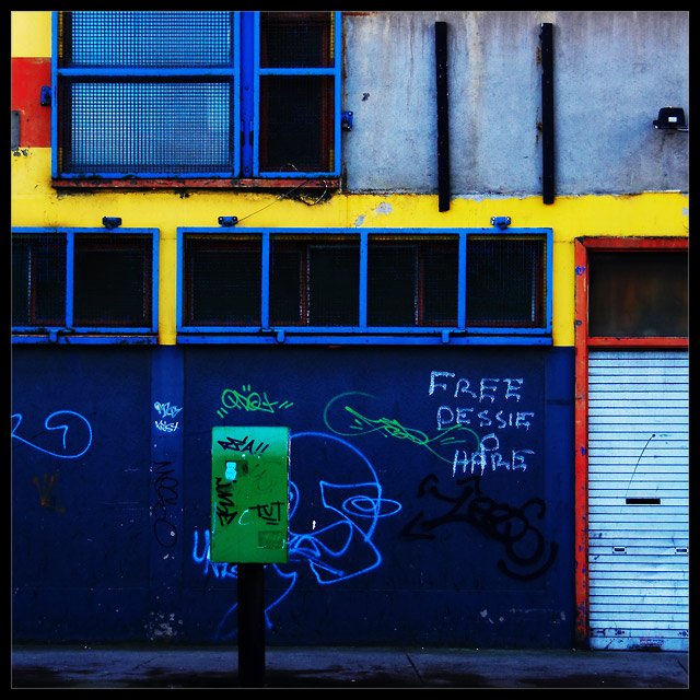
| I think I recognise this place. Nicely done. |
|
| Photographer found comment helpful. |
|
|
10/10/2005 03:27:53 PM |
another "colors of the rainbow" picture. i like the composition and the crop but this is just not fit for "complementary colors".
|
|
| Photographer found comment helpful. |
|
|
10/08/2005 11:19:55 PM |
| Nice contrasting colors. More of a foucs on primary colors than complementary. |
|
| Photographer found comment helpful. |
|
|
10/08/2005 05:35:39 PM |
| wonder where this is?great shot,looks like you got your colour wheel out and invested in a few pots of paint,and it isn't flora! 8 |
|
| Photographer found comment helpful. |
|
|
10/07/2005 05:22:26 PM |
| Really sharp photo, doesn't meet the challenge though. |
|
| Photographer found comment helpful. |
|
|
10/07/2005 12:42:58 PM |
| Don't know if it is comlementary.. but frankly I don't care. I enjoy this a lot. 9 |
|
| Photographer found comment helpful. |
|
|
10/06/2005 12:14:34 AM |
| i like urban shots like these, but the only thing to be careful of is there's alot going on, pretty busy--i'd probably do some cropping. Maybe a tight vertical crop to capture the bright yellows/blues as well as some graffiti--disregard the mailbox...nice shot |
|
| Photographer found comment helpful. |
|
|
10/05/2005 04:12:42 PM |
| Now this is my kind of image, gritty, urban and in your face. No doubt whatsoever about it meeting the challenge. Composition seems good although I would have personally had the green mailbox more to the left of the image.*Shrugs Shoulders* Maybe this was something that couldn't be helped. Gets an 8 from me. Good luck |
|
| Photographer found comment helpful. |
|
|
10/05/2005 09:48:00 AM |
| I like the urban sense of this. Not the most interesting shot, but it works for me. |
|
| Photographer found comment helpful. |
|
|
10/05/2005 08:08:00 AM |
| Wow, what a perfect find for this challenge! Love the colors. The payphone adds a lot. |
|
| Photographer found comment helpful. |
|
|
10/05/2005 01:06:53 AM |
| Fantastic choice of location. m I love the life in these colours. 10. |
|
| Photographer found comment helpful. |
|
|
10/05/2005 12:33:04 AM |
|
| Photographer found comment helpful. |
|
|
10/05/2005 12:15:59 AM |
|
| Photographer found comment helpful. |
Home -
Challenges -
Community -
League -
Photos -
Cameras -
Lenses -
Learn -
Help -
Terms of Use -
Privacy -
Top ^
DPChallenge, and website content and design, Copyright © 2001-2025 Challenging Technologies, LLC.
All digital photo copyrights belong to the photographers and may not be used without permission.
Current Server Time: 03/12/2025 02:53:16 AM EDT.