| Author | Thread |
Comments Made During the Challenge  |
|
|
10/10/2005 08:25:13 AM |
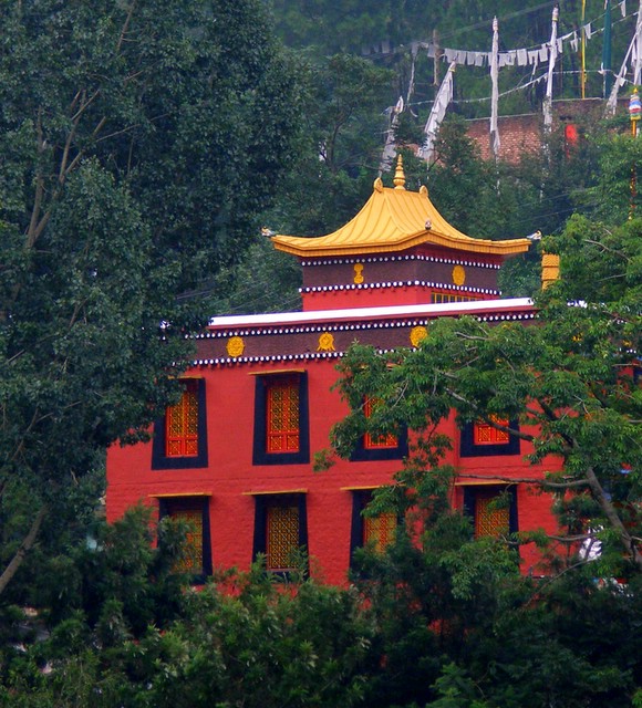
| Great shot of the temple, but your main complementary colours of the red bricks and the green foliage are diluted with the yellow/violet colours on the roofline and the blue/orange in the windows. You could have cropped tighter to the building to show just red and green to demonstrate the complementary colour contrast. |
|
|
|
10/06/2005 08:00:19 AM |
| If you had cropped it more from the top, about the top of the spire, got rid of the white, would have scored higher from me anyway, otherwise nicely done |
|
|
|
10/05/2005 09:06:46 AM |
| Meets the challenge, looks to be leaning a little? |
|
Home -
Challenges -
Community -
League -
Photos -
Cameras -
Lenses -
Learn -
Help -
Terms of Use -
Privacy -
Top ^
DPChallenge, and website content and design, Copyright © 2001-2025 Challenging Technologies, LLC.
All digital photo copyrights belong to the photographers and may not be used without permission.
Current Server Time: 03/13/2025 09:13:39 AM EDT.