| Author | Thread |
Comments Made During the Challenge  |
|
|
06/17/2003 08:58:34 PM |
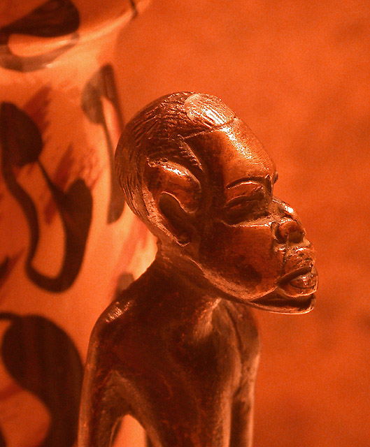
| Colors seem strange, but this does not detract. Very nice, evocative shot. I like the feeling that this collection goes on, hinted by the vase in the background. |
|
 Photographer found comment helpful. Photographer found comment helpful. |
|
|
06/17/2003 06:47:31 PM |
| Great shot! The details are nice. Very fitting! |
|
| Photographer found comment helpful. |
|
|
06/17/2003 10:05:56 AM |
| Excellent use of colour (was it taken this way or colourised afterwards?). Nice composition, interesting background. 8 |
|
| Photographer found comment helpful. |
|
|
06/16/2003 03:48:12 PM |
| The composition with the light and dark background with similar tones against the statue look great, I could see this on a cover. One of my favourites of the challenge. |
|
| Photographer found comment helpful. |
|
|
06/16/2003 01:02:14 PM |
I'm not sure I like how this is divided in the background by that pot. The pattern is a bit distracting from the main subject in the front. The angle and framing/cropping of the statue is good. and I could see this on the front cover, with a different background. maybe just a plain one. continue the right side all the way to the left edge of the frame, and I think that would appeal to me more.
|
|
| Photographer found comment helpful. |
|
|
06/14/2003 04:08:57 PM |
| I really like the color of this image. This is "cover quality" all the way. |
|
| Photographer found comment helpful. |
|
|
06/14/2003 07:05:55 AM |
I think i know him :)
Nice shot. |
|
Home -
Challenges -
Community -
League -
Photos -
Cameras -
Lenses -
Learn -
Help -
Terms of Use -
Privacy -
Top ^
DPChallenge, and website content and design, Copyright © 2001-2025 Challenging Technologies, LLC.
All digital photo copyrights belong to the photographers and may not be used without permission.
Current Server Time: 03/12/2025 07:36:20 AM EDT.