| Author | Thread |
|
|
06/23/2003 03:46:09 PM |
*Critique Club*
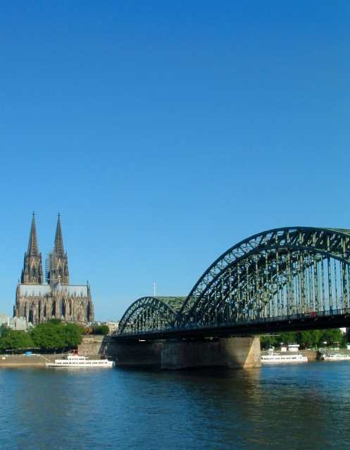
I see a really nice angle and framing/cropping. I think this is a good shot of a really nice looking city. The Sky is beautiful. Not white and blown out like I see so many skies.
Your focus seems just to be a little bit soft. I'm not really seeing a crisp area of focus. It's not BAD, but I would just like to see it a little sharper to bring out details in the bridge and building.
I do like how your bridge leads our eyes right into the photo to the building.
I'm one who likes the negative space at the top. I think it's a lovely blue, and would leave plenty of room for a title, and then still leave some negative space between title and subjects.
The lighting conditions look to have been very nice for this shot. Isn't it very nice when the weather cooperates for a shot?
Overall a nice shot, which I could see on the front of a magazine.
~Heather~ |
|
 Photographer found comment helpful. Photographer found comment helpful. |
Comments Made During the Challenge  |
|
|
06/17/2003 03:11:28 PM |
| I've seen photos of this place on photosig, I think you should of tried to get more of the bridge in the shot or leave it out. |
|
| Photographer found comment helpful. |
|
|
06/17/2003 11:39:55 AM |
| I think this would be a good shot if the focus were tighter and more of the bridge contained in the shot. |
|
| Photographer found comment helpful. |
|
|
06/16/2003 05:34:29 PM |
|
| Photographer found comment helpful. |
|
|
06/15/2003 05:58:42 PM |
| Ah Köln! My favourite German city, and I know exactly the spot you were standing! Been there, done that. Love your composition - Gary |
|
| Photographer found comment helpful. |
|
|
06/14/2003 07:53:50 AM |
| Great image, suits the theme of this week\'s challenge very well. 8 Morgan |
|
| Photographer found comment helpful. |
|
|
06/14/2003 05:18:33 AM |
| A nice picture although there is a loss of focus from the middle to the end. |
|
| Photographer found comment helpful. |
|
|
06/13/2003 08:42:54 PM |
| I think this one needs to focus on one of these great pieces of architecture. both of them is a little cluttered and tough for the viewer to choose what to look at. |
|
| Photographer found comment helpful. |
|
|
06/13/2003 03:59:29 PM |
| Don't they always have some person being lazy on the cover? |
|
| Photographer found comment helpful. |
|
|
06/12/2003 09:38:52 PM |
| Really a beautiful image. My only complaint is there is too much sky above the focal point. Assuming you were leaving room for a magazine title, it would still be a bit too much sky. |
|
| Photographer found comment helpful. |
|
|
06/12/2003 09:26:08 AM |
| Really nice... I gave it a 10. |
|
| Photographer found comment helpful. |
|
|
06/11/2003 01:06:23 PM |
| This is a beautiful shot - it would make a nice calendar photo. I'd like a couple of puffy white clouds to balance out the blue sky, I think. But overall very lovely. |
|
| Photographer found comment helpful. |
|
|
06/11/2003 12:23:53 PM |
| Where is this? Looks beautiful, looks like Prague. |
|
| Photographer found comment helpful. |
|
|
06/11/2003 10:32:06 AM |
| This would do just fine for the magazine. Nice coloring and composition. |
|
| Photographer found comment helpful. |
|
|
06/11/2003 06:29:22 AM |
| I wish there was a little less dof. Maybe a little more crop on the top. |
|
| Photographer found comment helpful. |
|
|
06/11/2003 01:49:23 AM |
| nice angle, perspective and colours |
|
| Photographer found comment helpful. |
|
|
06/11/2003 01:09:46 AM |
| Beautiful. Love the negative space of the sky. |
|
| Photographer found comment helpful. |
|
|
06/11/2003 01:06:28 AM |
Reminds me of a travel & leisure mag...lol nice photo...
JB |
|
| Photographer found comment helpful. |