| Author | Thread |
Comments Made During the Challenge  |
|
|
10/20/2005 11:10:14 PM |
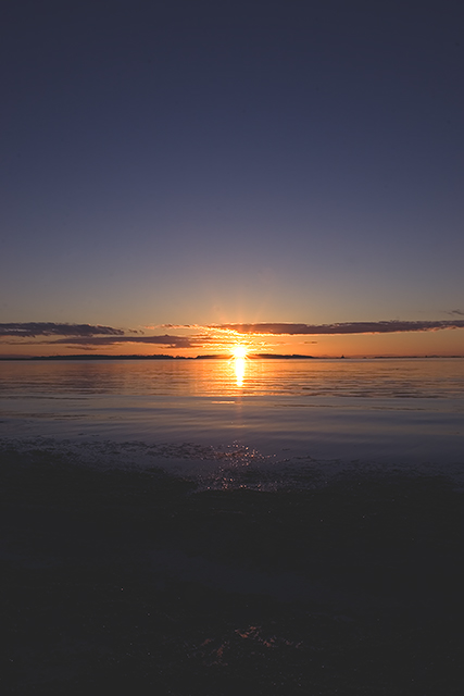
| Beautiful shot. Love the transition of shades throughout. Seems common that this type of picture is better done with landscape orientation but This works too. |
|
|
|
10/20/2005 05:34:39 PM |
| Appears to be a bit over saturated! |
|
|
|
10/18/2005 01:15:21 PM |
| i think i would have liked this better in landsape mode |
|
|
|
10/18/2005 05:26:24 AM |
| I can see that you've used a wide angle with the and the sunrise colours in the centre are well exposed. For me, the composition is a little too centred for my liking and the foreground is too dark. I'm not sure if you used any filters on this to help with the exposure control, but I would have liked the forground to have been a little lighter to emhasize the depth of the wide angle. JMO. |
|
|
|
10/18/2005 12:17:42 AM |
Fit Challenge Criteria: 2/2
Contrast/Color: 2/2
Composition: 0/2
Photo Quality: 1/2
My Subjective Affinity: 1/2
This composition is too centered, both horizontal and vertical. |
|
|
|
10/17/2005 04:52:10 PM |
| I like the fact that you didn't do the usual horizontal shot here... I think it lends itself well to your title... I would however have possibly liked to have seen more ocean (or maybe even sand (or whatever you were standing on)) and less sky - because the sky here isn't partcularly spectacular. Be careful... there is something to the "rule of thirds" your sun is almost dead center... which doesn't allow for the eye to transverse the rest of the photo. |
|
|
|
10/17/2005 01:47:18 PM |
| looks like you might of brightened the foreground a little too much...but the rest looks good |
|
|
|
10/17/2005 10:28:09 AM |
| You generally want to try and place your horizon either 1/3 of the way down the picture or 1/3 of the way up. Having the horizon this centered causes my eye to bounce back and forth searching for an interesting foreground or sky. Also, the shot may have improved with an object in the foreground (unless there is already something there in the dark that I can't make out). Nice colors captured here. |
|
|
|
10/17/2005 01:07:44 AM |
| Too perfectly symmetrical to work for me. More detail int he foreground would have made this composition more palatable. I can see a hint of it, but not enough to carry it. |
|
|
|
10/17/2005 12:36:36 AM |
| I really think it would have been better if you had cropped out some of the foreground. Rule of thirds applies here. (IMNSHO) Good color and clouds. |
|
Home -
Challenges -
Community -
League -
Photos -
Cameras -
Lenses -
Learn -
Help -
Terms of Use -
Privacy -
Top ^
DPChallenge, and website content and design, Copyright © 2001-2025 Challenging Technologies, LLC.
All digital photo copyrights belong to the photographers and may not be used without permission.
Current Server Time: 03/12/2025 07:07:40 PM EDT.