| Author | Thread |
Comments Made During the Challenge  |
|
|
06/17/2003 04:12:53 PM |
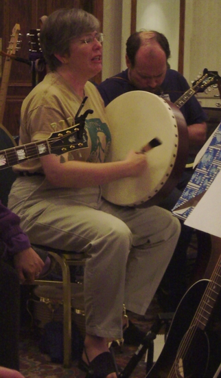
| She looks like she's in pain and the balding dude is distracting. Try focusing the attention on the subject. |
|
|
|
06/17/2003 02:04:39 PM |
| A bit dark, but a fun view. The motion of the drummer's hand shows the action, where the rest is fairly solid. The guitar head coming across the subject is a bit unfortunate. 6 Rob the Swash |
|
 Photographer found comment helpful. Photographer found comment helpful. |
|
|
06/16/2003 08:56:08 PM |
The composition is so crowded, and the shot is also a bit dark and out of focus. This really detracts from its ability to appear on a cover of a magazine, as there is no pop to the picture and no place to put any text conveniently.
Message edited by author 2003-07-21 02:26:38. |
|
| Photographer found comment helpful. |
|
|
06/16/2003 12:17:34 PM |
| Underexposed and focus is too soft (possibly due to exposure?). Also, I find the guitar jutting out from the left into the woman's arm and chest to be distracting. |
|
| Photographer found comment helpful. |
|
|
06/14/2003 04:53:26 PM |
| Shot is much too dark. Guitar is bumping into the breast of the main subject. A yellow-green colorcast from the indoor lighting permeates the shot. Keep these in mind next time... |
|
| Photographer found comment helpful. |
|
|
06/13/2003 06:39:50 PM |
| Needs better lighting for sure. I think that would help a lot at creating a more crisp shot with clearer more vibrant colors. |
|
| Photographer found comment helpful. |
|
|
06/13/2003 04:44:38 PM |
|
|
|
06/13/2003 01:29:27 AM |
| I remember Singout magazine so well! This is an excellent shot for that wonderful periodical! (Wish it were the tiniest bit enhanced though! To make it stand out a tetch more...) |
|
| Photographer found comment helpful. |
|
|
06/12/2003 09:54:37 AM |
| The lighting is a bit dark for me, and the photo seems grainy. I can see this as a mag cover for sing out though! |
|
| Photographer found comment helpful. |
|
|
06/11/2003 11:25:52 PM |
| Seems a bit dark (even for my monitor). I am quite distracted by everything around the 'singing' subject. Perhaps a closer shot, at a different angle to remove the background guitarist would have been better and more usable as a cover. |
|
| Photographer found comment helpful. |
|
|
06/11/2003 02:03:05 PM |
|
| Photographer found comment helpful. |
|
|
06/11/2003 12:56:16 PM |
| The main subject looks unhappy and the movement has made the focus poor. The arm at the left of the picture is distracting and the man on the right is mostly obscured. I think it's too busy and not sharp enough to be a magazine cover, and it's also lacking any "wow" appeal. |
|
| Photographer found comment helpful. |
|
|
06/11/2003 03:09:23 AM |
|
| Photographer found comment helpful. |
Home -
Challenges -
Community -
League -
Photos -
Cameras -
Lenses -
Learn -
Help -
Terms of Use -
Privacy -
Top ^
DPChallenge, and website content and design, Copyright © 2001-2025 Challenging Technologies, LLC.
All digital photo copyrights belong to the photographers and may not be used without permission.
Current Server Time: 03/14/2025 06:02:49 AM EDT.