| Author | Thread |
|
|
06/23/2003 01:57:19 AM |
| Either make the crop tighter or let the whole of it show! Nice shot and colors! |
|
 Photographer found comment helpful. Photographer found comment helpful. |
Comments Made During the Challenge  |
|
|
06/17/2003 11:57:59 AM |
| Cute picture, but it really needs a more festive background. |
|
| Photographer found comment helpful. |
|
|
06/15/2003 10:41:30 PM |
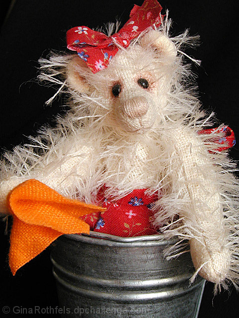
| Very cute... did you make the bear? I like this... really good lighting... love the black background overall pretty good. Not particularly exciting, but it is a stuffed bear I would have liked a little more room at the top for type. |
|
| Photographer found comment helpful. |
|
|
06/15/2003 03:18:00 AM |
| That is one sorry looking teddy :) It needs a haircut! Nice even lighting and composition. There's a crease in the black background which is showing. Overall, a nice effort. 8. |
|
| Photographer found comment helpful. |
|
|
06/14/2003 01:19:09 AM |
| Hmmmm. Nice Advertisement. |
|
| Photographer found comment helpful. |
|
|
06/13/2003 01:32:31 PM |
| Cropped too tighly on the sides? Some black neg space on top would have been nice too, |
|
| Photographer found comment helpful. |
|
|
06/12/2003 04:48:34 PM |
| Great composition. It's nice to see a craft magazine cover. I really like how you captred the fuzzieness of the bear and the pose. |
|
| Photographer found comment helpful. |
|
|
06/12/2003 08:50:49 AM |
| This pretty much does everything that needs to be done for a magazine, colours to draw the eye, a clear illustration of what the mag is about, solid blocks of colour to get text up against it. Perhaps having a go at some of the extraneous fluff (bottom right and top left) with scissors is the only thing I can spot. |
|
| Photographer found comment helpful. |
|
|
06/11/2003 06:35:42 PM |
| Although this picture is not a personal favorite of mine, I can't look past the fact that this is actually more like a magazine cover than 99% of the pictures in this challenge. I hope you score well with this picture. I'm giving it a 10. |
|
| Photographer found comment helpful. |
|
|
06/11/2003 05:55:57 AM |
| It looks a little to cropped for me. |
|
| Photographer found comment helpful. |
|
|
06/11/2003 01:25:42 AM |
| Very good. Need more space up top for the title though. Cropping there feels a little too tight. Otherwise perfect! |
|
| Photographer found comment helpful. |
|
|
06/11/2003 01:25:12 AM |
| Wow - I kinda underestimated this shot due to the subject matter, but it actually quite nicely photographed. The lighting is not to harsh, and the crop, after first appearing a bit tight at the top, it probably just right. Good Luck! 7 |
|
| Photographer found comment helpful. |
Home -
Challenges -
Community -
League -
Photos -
Cameras -
Lenses -
Learn -
Help -
Terms of Use -
Privacy -
Top ^
DPChallenge, and website content and design, Copyright © 2001-2025 Challenging Technologies, LLC.
All digital photo copyrights belong to the photographers and may not be used without permission.
Current Server Time: 03/12/2025 02:12:04 AM EDT.