| Author | Thread |
Comments Made During the Challenge  |
|
|
06/17/2003 11:26:04 AM |
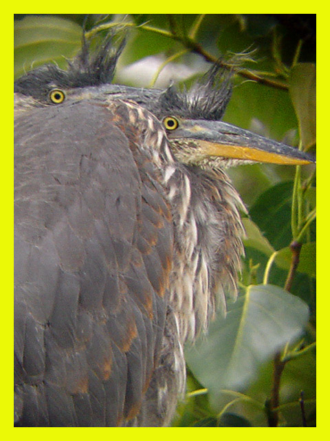
| The compisition of this shot is very good. I like the two birds. I don't think the yellow border suits your image and the shot is a little blurry. |
|
 Photographer found comment helpful. Photographer found comment helpful. |
|
|
06/14/2003 08:42:50 PM |
| I like the way the young herons are "puffing up" to make them appear larger to discourage potential prey...the background is exquisite . Very well done.(10) |
|
| Photographer found comment helpful. |
|
|
06/13/2003 06:39:17 PM |
One thing I've realized this challenge, is that slapping a yellow border on something definately does not make it National Geographic. The focus here is way too soft, and the shot is really grainy. What bothers me most though, is the fact that the large leaf in the bottom right is partially semi-focussed, and partially unrecognizable.
It is a good angle on the birds, and the closeness is great for the front cover. Wish you hadn't clipped the beak with the border though. |
|
| Photographer found comment helpful. |
|
|
06/13/2003 01:36:24 PM |
| the yellow detracts big time - I suppose you were going for the national geographic look, but as a stand alone image, the yellow border draws attention away from the yellow eyes and beak which should be the focal point. You have done a nice job of picking up that yelow in the leaves benind while the orange of the beak is picked up by the feathers. Get rid of the border and you have a strong photo. |
|
| Photographer found comment helpful. |
|
|
06/13/2003 08:33:11 AM |
| that DOES look like a NG cover. nice going 9 |
|
| Photographer found comment helpful. |
|
|
06/13/2003 01:26:18 AM |
| Awesome capture! Hope you post the whole series - I bet it was hard to pick just one... |
|
| Photographer found comment helpful. |
|
|
06/12/2003 10:06:55 AM |
| Night Herons? Or maybe Tri-colored? Nice job! |
|
| Photographer found comment helpful. |
|
|
06/11/2003 11:48:09 PM |
| I don't think this would have made it to the 'cover'. There is too little seperation between the two birds |
|
| Photographer found comment helpful. |
|
|
06/11/2003 02:27:21 PM |
| I like this and think it suits the mag, the only thing that bothers me is whether or not there would be room for the title. Good work all the same though, and a 7 for me. |
|
| Photographer found comment helpful. |
|
|
06/11/2003 11:16:33 AM |
| It's a good idea -- even though numerous others have tried the National Geographic theme this week. My criticism would be that the shot is a bit out of focus, and the yellow you chose might be a teeny bit harsh compared to the one they actually use in the magazine. |
|
| Photographer found comment helpful. |
|
|
06/11/2003 10:49:48 AM |
are these the same little herons from the "home sweet home" by any chance?
* * * * * * *
i knew it was them! they are so-o-o-o cute!
Message edited by author 2003-06-18 13:12:31. |
|
| Photographer found comment helpful. |
|
|
06/11/2003 01:56:09 AM |
| Nice! I could definitely see this as a National Geographic cover. very nicely done! How much did you crop in for this photo? One thing to look at is that your yellow doesn't quite look right for NG. I'm not taking off for that though. Just being nitpicky. Do you know what kind of birds these are? good job |
|
| Photographer found comment helpful. |
|
|
06/11/2003 01:36:57 AM |
| I can really see this on thier cover. Nice work! |
|
| Photographer found comment helpful. |
|
|
06/11/2003 12:35:14 AM |
| hmm your herons in the yard growing up maybe? |
|
| Photographer found comment helpful. |
Home -
Challenges -
Community -
League -
Photos -
Cameras -
Lenses -
Learn -
Help -
Terms of Use -
Privacy -
Top ^
DPChallenge, and website content and design, Copyright © 2001-2025 Challenging Technologies, LLC.
All digital photo copyrights belong to the photographers and may not be used without permission.
Current Server Time: 03/12/2025 08:55:19 AM EDT.