| Author | Thread |
Comments Made During the Challenge  |
|
|
06/17/2003 09:05:50 PM |
| Nice details, well composed. This would be hard to crop into a magazine format, though. Wonderful use of light and tones. 8 |
|
|
|
06/17/2003 11:52:29 AM |
| This shot has interesting lines in it. |
|
|
|
06/17/2003 07:06:36 AM |
| Excellent detail and composition. |
|
|
|
06/16/2003 12:49:59 PM |
| I don't personally find this to be a very enticing picture. Perhaps a different angle, or sharper blacks and whites? |
|
|
|
06/16/2003 04:57:16 AM |
| it is a little bit too dark, you should be using better lighting. Also white balance looks incorrect. composition is OK. |
|
 Photographer found comment helpful. Photographer found comment helpful. |
|
|
06/14/2003 05:29:40 PM |
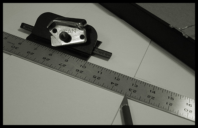
| This is too hard on the eye to make a sucessful mag cover. Perhaps show a finished photo with the matting around it and the cut off strips with the tools laying to the side.... but the tools alone are too 'ugly'.... |
|
|
|
06/14/2003 12:10:53 PM |
| I like the diagonals in this shot. Focus and clarity are really doo as well. Nice crisp numbers on the ruler. Lighting is ok. No bad glares, but I wish that the shadow on the diagonal object in the upper right were a bit more subtle. Overall nice shot though. |
|
| Photographer found comment helpful. |
|
|
06/13/2003 11:06:00 AM |
|
|
|
06/12/2003 04:03:27 PM |
| I like the idea, and black and white was a good choice. I think the picture overall would benefit from maybe a little brighter lighting and a little more contrast. Still, a nice picture as is. |
|
| Photographer found comment helpful. |
|
|
06/12/2003 04:08:17 AM |
| Personally I do not consider magazines to be in a horizontal shape... thats just me though. Is the matte board grey, or should you have increased the contrast some? I guess I could see this on the said magazine... I think it depends on how high-tech the magazine gets. Technically it's a very good photo... I guess I would have liked to have seen it as a vertical instead of a horizontal, I think it would have improved it as a magazine cover, and probably improved your score as well. |
|
|
|
06/12/2003 12:16:59 AM |
| it would look more like a magazine cover if it was a little brighter and more in the shape of a magazine cover. |
|
|
|
06/11/2003 05:45:19 AM |
Picture should be tall than wider for my kind of magazine.
The picture is a little dark for me to see on a cover page. |
|
Home -
Challenges -
Community -
League -
Photos -
Cameras -
Lenses -
Learn -
Help -
Terms of Use -
Privacy -
Top ^
DPChallenge, and website content and design, Copyright © 2001-2025 Challenging Technologies, LLC.
All digital photo copyrights belong to the photographers and may not be used without permission.
Current Server Time: 03/12/2025 01:43:26 PM EDT.