| Author | Thread |
Comments Made During the Challenge  |
|
|
10/23/2005 07:47:10 AM |
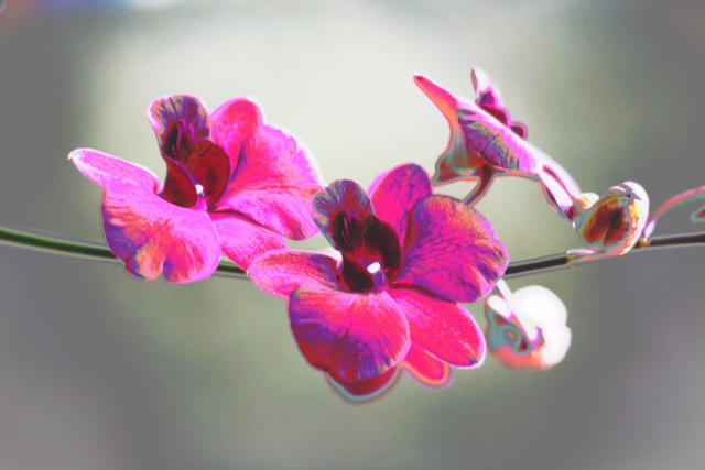
| the colours look too over-saturated for my taste. but i guess that's what you aimed, fits to the title. |
|
 Photographer found comment helpful. Photographer found comment helpful. |
|
|
10/22/2005 08:47:45 PM |
| For me, I don't mind seeing some post-editing manipulation, but this seems overly processed. The magenta is blown way out there, but then again, that could be the effect you were going for. I do wonder what the original was like before manipulation. |
|
| Photographer found comment helpful. |
|
|
10/22/2005 06:02:53 PM |
| Very interesting, but good |
|
| Photographer found comment helpful. |
|
|
10/21/2005 07:49:25 PM |
| Very nice...Great job..!! |
|
| Photographer found comment helpful. |
|
|
10/20/2005 02:55:50 AM |
| The colours are over-saturated. |
|
|
|
10/19/2005 08:46:45 AM |
| Not crazy about the oversaturation of color, but I see the point, given the challenge. I think if the background were more of a contrasting color, it'd have more of that Andy Warhol feel to it. |
|
| Photographer found comment helpful. |
|
|
10/19/2005 02:27:03 AM |
| oo very pretty. it seems a little over contrasted, but i still like the colors. there's a little blue line thing at the top left hand corner, it kind of annoys me, but awesome job! good luck |
|
| Photographer found comment helpful. |
Home -
Challenges -
Community -
League -
Photos -
Cameras -
Lenses -
Learn -
Help -
Terms of Use -
Privacy -
Top ^
DPChallenge, and website content and design, Copyright © 2001-2025 Challenging Technologies, LLC.
All digital photo copyrights belong to the photographers and may not be used without permission.
Current Server Time: 03/12/2025 07:00:46 PM EDT.