| Author | Thread |
|
|
11/03/2005 03:34:30 PM |
Greetings from the Critique Club:
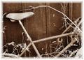
The challenge was Image Grain and the use of grain or noise to enhance your photo.
Technical:
Thanks for including your steps for processing. I have spent some time studying this shot and something bugs me about the overall effect, whether it is too much grain, sharpening or Neat Image, I'm not sure. The trees at the top look too sharpened, as do the bones on the sleepers.
Composition:
It has a real old feel with the sepia toning and the tilting angle of the tracks. It does a good job leading the eye, past the bones and along the sweeping track. Nothing really to comment on with your setup and execution.
Personal:
I would like to see what the shot looked like with less grain and sharpening. It could be a little darker to bring the trees into the picture. However, the lighter top end of the shot does create an old world feeling. The bones are a nice touch. It is certainly more effective having the horizon tilting in the direction of the curve and the title is very apt. A worthy entry which was let down by the artifacts already mentioned, perhaps most of these are due to saving for web. If so, then you have suffered in your final score. As submitted I feel you scored around about the right mark. Hope this proves helpful and constructive.
Steve |
|
 Photographer found comment helpful. Photographer found comment helpful. |
|
|
11/01/2005 05:54:00 PM |
| Great angle and mood, I can hear the whistle coming! |
|
| Photographer found comment helpful. |
Comments Made During the Challenge  |
|
|
10/28/2005 10:02:49 PM |
| Ironically, I would have loved this more if it had a little LESS grain. The noise is a little too distracting, but I love the set up very much. Lots of movement in this photo. |
|
| Photographer found comment helpful. |
|
|
10/27/2005 01:17:19 AM |
| Cool approach, the angle and color are great. |
|
| Photographer found comment helpful. |
|
|
10/26/2005 10:31:54 AM |
| Alittle darker? fuller range |
|
| Photographer found comment helpful. |
|
|
10/24/2005 10:34:02 AM |
| i like the angle but i dont like the crop. its too low on the top. plus it seems to be way oversharpened. |
|
| Photographer found comment helpful. |
|
|
10/24/2005 06:42:09 AM |
|
| Photographer found comment helpful. |
|
|
10/24/2005 12:21:46 AM |
| I love this with the skeleton and all. Love the title. The perspective is well done and the leading line sends you throug the shot. Great use of the title subject. It suits it perfectly!! Way to go. |
|
| Photographer found comment helpful. |
Home -
Challenges -
Community -
League -
Photos -
Cameras -
Lenses -
Learn -
Help -
Terms of Use -
Privacy -
Top ^
DPChallenge, and website content and design, Copyright © 2001-2025 Challenging Technologies, LLC.
All digital photo copyrights belong to the photographers and may not be used without permission.
Current Server Time: 03/14/2025 10:19:12 PM EDT.